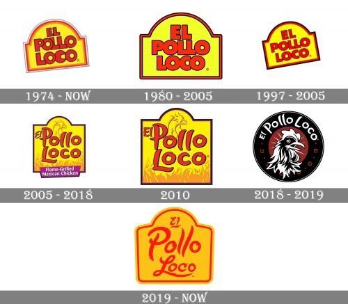
The restaurant chains El Pollo Loco have had at least seven different logotypes so far. Some of the distinctive features present on most of the versions have been the combination of yellow and red as well as the unusual shape of the logo.
Meaning and history
The first location opened in Guasave, Sinaloa, Mexico in 1974. The chain started working in the US in 1980. Only three years later, the restaurants in the US were sold to another owner. As a result, two independent restaurant chains appeared, each controlled by a different company: El Pollo Loco, Inc. (the US) and El Pollo Loco, S.A. de C.V. (Mexico).
1974
The original El Pollo Loco logo features the name of the brand in large red letters inside an unusual shape. It can be described as a combination of a rectangle and a circle. The shape is slightly sloped. The glyphs partly overlap.
El Pollo Loco, Inc.
1980
The rectangle-circle hybrid shape is positioned horizontally. The letters have been slightly pulled away from each other (although they still overlap). The colors have grown brighter.
1997
Once again, the logo has been tilted.
2005
The design has been redrawn from scratch. The type is now a playful and casual one. The article “El” has grown smaller – it is squeezed near the border. A chicken and flame appeared in the background.
2010
The style of the “EL” has grown somewhat closer to the rest of the text, and there have been a couple of other subtle updates.
2018
The design has gone through a complete overhaul dropping the familiar hybrid shape and the palette. It still features a chicken, though.
2019
The chain has returned to the yellow-and-red palette and hybrid shape that has been characteristic of the El Pollo Loco logo for years.


