Western Union is a money transfer and finance company, which was established in 1851 in the USA. Today the company operates across the globe and is one of the best known American firms worldwide.
What is the symbol of Western Union Company?
The symbol of the Western Union is a combination of two slanted lines, going from the upper left corner to the bottom right one. The parallel lines are usually set in yellow on a black background and symbolize motion and transition, reflecting the purpose of the company. At the beginning of WU history, the lines were drawn vertically straight and got slanted only in 2013.
Meaning and history
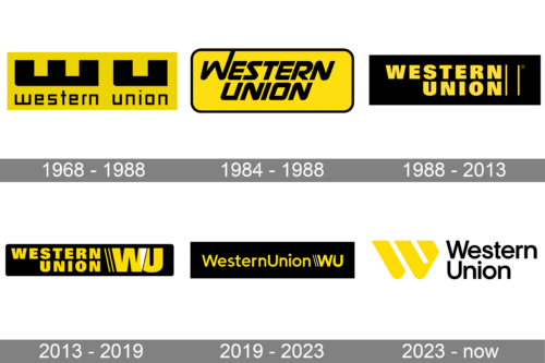
The main thing, which makes all of the Western Union logos, created throughout the company’s history, look alike, and increases its recognizability, is the yellow and black color palette, which was introduced with the very first logo, designed in 1969, and still stays with the brand.
1968 – 1988
The original logo for Western Union boasted a bright yellow rectangular badge with massive black lettering on it. The lettering was split into two levels, with the extra-thick “WU” in a custom geometric sans-serif on top, and the whole “Western Union” inscription under it. The bottom part of the logo was executed in the lowercase of a strong and futuristic sans-serif typeface, which added a sense of progressiveness and speed.
The logo was also available in other color combinations: monochrome, yellow and white, or yellow lettering on a black background, which later became the brand’s signature version.
1984 – 1988
The designers brought the full name to the spotlight, removing the initials seen in the previous logo. The new logo, though, preserved the black and yellow color. The rectangular shape not only got rounded corners but also a thin black frame. The new inscription is done in all uppercase letters using a bold font with fluent, rounded strokes. It looks somewhat similar to Akceler C Alt Bold.
1988 – 2013
The redesign of 1988 made the Western Union logo look more elegant and professional, switching the massive a custom typeface to a mode delicate and traditional sans-serif, and writing the wordmark in all capitals. The main color palette now featured a black background and yellow accents. Another new thing about the brand’s logo was two parallel lines, placed vertically on the right from the inscription, also in yellow.
2013 – 2019
In 2013 the badge got stretched horizontally to accommodate a bright and massive emblem, put on the right from the lettering, after the two lines, which became diagonal now. The emblem featured two extra-bold overlappings “WU”, which were colored white in the overlapping spot, and gained a thin black line, repeating the contour of the “W”. The emblem could be used on its own in the original palette, or monochrome.
2019 – 2023
The Western Union Logo became simpler and more sophisticated in 2019 when the typeface of the inscription and the emblem gained thinner and cleaner lines. The wordmark is now written in a title case, with only “W” and “U” capitalized, and the letters of the monogram became lighter and more stylish. Now the “W” overlaps the “U”, making its black contour cut the second letter’s upper part diagonally, and the two lines, separating the logotype from the signifier are colored white.
2023 – now
The new logo broke the over fifty-year history of a rectangular background. The new logo had just the name with a “W” emblem on the left. The latter was printed in yellow with one of the diagonal strokes being disconnected from the rest of the letter. The “Western Union” portion was printed in two lines in black using a sans-serif font similar to URW Geometric SemiBold. The logo turned out minimalistic and modern.


