

![]() San Jose Earthquakes Logo PNG
San Jose Earthquakes Logo PNG
San Jose Earthquakes is the name of a football club, which was established in 1994 in California, USA. Today it is a pretty successful club of Major League Soccer. Owned by Earthquake Soccer company, the team, also known as “The Goonies” has Matias Almeyda as the head coach.
Meaning and history
![]()
The visual identity of the American football club can be split into three parts — the first one when the team was formed under the name San Jose Clash, then the “tri-angular” badge era, from 2000 to 2013, and, finally the modern sleek version, created in 2014, which became a symbol of the new times for the club and their new approach to the game.
1995 — 1999

The logo for the San Jose Clash club was designed in 1995 and stayed with them until 2000 when the name was changed. It was a red and black badge with the styl-ized image of a crab, placed vertically with his tail on curved on top.
The wordmark was placed between the claws, in the bottom part of the emblem. The “Clash” part was written in a neon-banner style, italicized yet strong and geometric. The “San Jose” inscription in all capitals was written under it in yellow color, executed in a thin sans-serif.
2000 — 2007
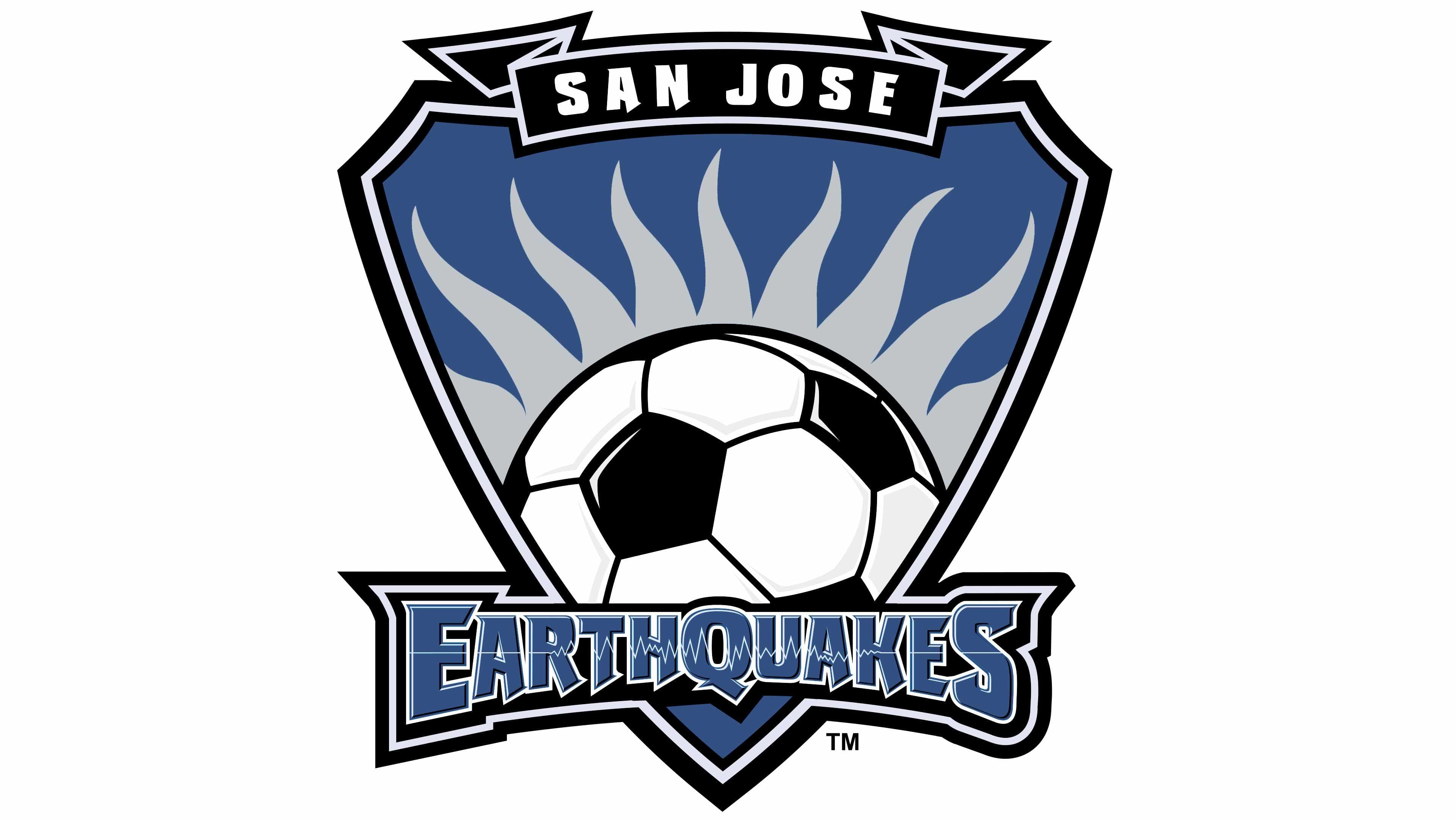
The Earthquakes club was Bowen in 2000 and the new logo as well. It was a trian-gular crest executed in blue and gray, with an enlarged monochrome football placed on its bottom part.
The ball had several gray flames coming out of it, resembling a smoke after a real earthquake.
The “San Jose” lettering was written in white on a black ribbon above the crest, and the “Earthquakes” nameplate in massive hard-rock style letters was placed on the banner, crossing the bottom of the emblem.
2008 — 2013
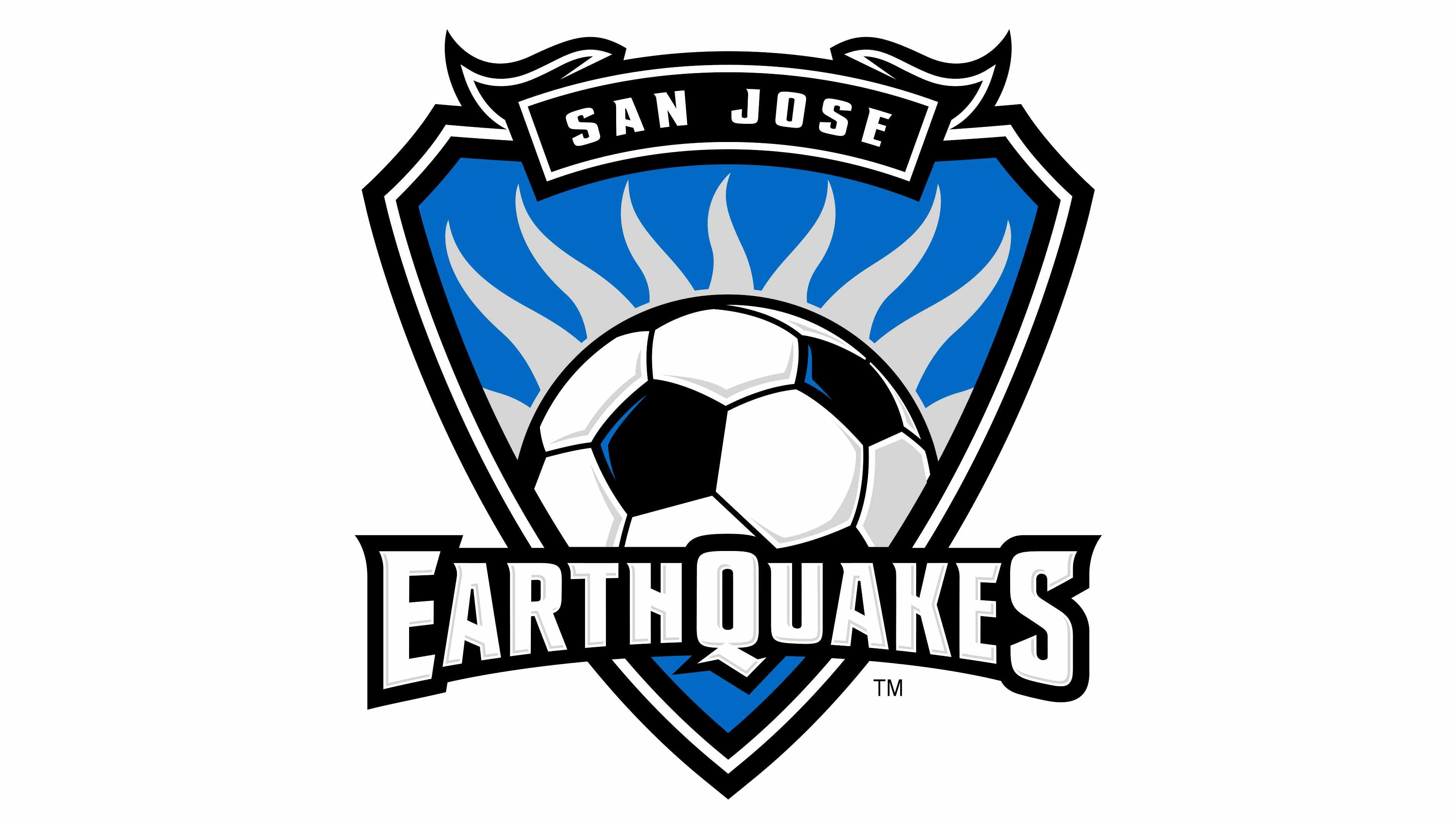
The badge was redesigned in 2008, getting more volume, by using gradient shades on the football. The composition wasn’t changed, but the “Earthquakes” wordmark now featured white and its typeface was replaced by a more modern and strong one.
The outline of the crest became more dusting due to the use of white color instead of gray from the previous version.
2014 — Today
![]()
A completely new badge was created for the club in 2014, it is a smooth traditional crest with rounded sides. The main color of the emblem is black, and the accent and letters are colored white, blue, and red. A perfect combination to represent power, passion, and determination.
The wordmark now is composed of the “Quakes” in capital letters with the “Q” en-larged, and a tagline, consisting of “San Jose 1974” in delicate sans-serif, white and red.
The football is placed in the middle of the crest, with two diagonal lines, white and blue, crossing the emblem from the upper left corner to the bottom right. On the right of the ball, there is a blue and black geometric pattern, and the left part of the shield is plain black.
San Jose Earthquakes Colors
BLACK
HEX COLOR: #1F1F1F;
RGB: (31,31,31)
CMYK: (73,67,65,79)
BLUE
HEX COLOR: #30457A;
RGB: (13, 76, 146)
CMYK: (99,83,24,9)
RED
HEX COLOR: #A42A35;
RGB: (164,42,53)
CMYK: (18,98,86,7)


