 Walgreens Boots Alliance Logo PNG
Walgreens Boots Alliance, Inc. is the owner of the pharmacy chains Walgreens and Boots, not to mention multiple other companies connected with drug production and marketing. The parent company is based in Deerfield, Illinois.
Meaning and history
For most of its history, the Walgreens boots Alliance logo has featured a combination of light blue and green. However, the design has gone through dramatic transformations.
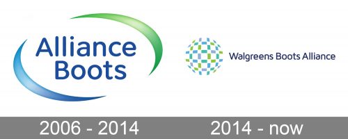
2006 – 2014 (Alliance Boots)
We should start with the logo of Alliance Boots, the company formed in 2006 as the result of the merger of the British pharmacist Boots Group and the pharmacy group Alliance UniChem.
The logo was dominated by the name of the brand. It was given in blue letters that provided excellent legibility. While the letters looked rather generic, they had rounded ends, which added a unique touch. Also, the ends echoed the pictorial part of the logo. It combined two dynamic curves placed from both sides of the wordmark. The negative space between them created an ellipse.
The ellipse was directed upwards and to the right, which in the language of symbols conveys optimism and the ability to embrace the future. The lower curve was light blue, while the upper curve was light green. They were white highlights, which created some depth.
2014 – present (Walgreens Boots Alliance)
In 2014, a 55% stake in the company was purchased by Walgreens, which already owned all the rest. The newly formed entity was named Walgreens Boots Alliance and given a new logo developed by Straightline, a brand strategy and design company.
Jim Skinner, the Executive Chairman of Walgreens Boots Alliance, described the logo as “an open, growing globe” symbolizing the brand’s capability to offer customers from various corners of the globe “products and services that enhance their health and well-being.”
In spite of all the differences, we can still state that the Walgreens Boots Alliance logo was based on the visual heritage of its predecessor.
Firstly, it borrowed the palette and slightly shifted it. This time, the letters were slightly darker. It was a crucial update, because the glyphs were smaller now. Had they been lighter, the legibility would have suffered.
What is Walgreens Boots Alliance
Walgreens Boots Alliance is a pharmaceuticals holding company based in Deerfield, Illinois, US. The smaller companies and brands owned by it are organized into three divisions: Retail Pharmacy USA, Retail Pharmacy International, and Pharmaceutical Wholesale.
The blue in the emblem is rather light and vivid. The emblem looks like a 3D circle. The ball is formed by small elements. The majority of them are rectangles. In addition to the blue and green elements, there are also gray ones. While the pictorial part of the logo looks different from the previous one, it shares the circle theme.
This theme could be traced even in the shape of the letters with their rounded ends. Some of the glyphs were tweaked and looked very unusual (note, for instance, the “a” and the “r”).
Colors and font
The combination of blue and green has been an essential part of the visual brand identity. This palette connotes purity (blue) and health/nature (green).
The distinctive feature of the 2006 logo was the type with rounded ends. However, the 2014 Walgreens Boots Alliance logo showcased dramatically different typography. While the overall proportions and shape of the letters were classic, there were a lot of characteristic small elements making the design stand out.


