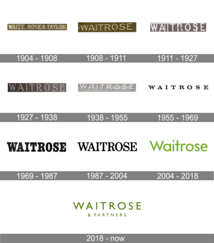
The British supermarkets Waitrose & Partners have had at least seven distinctive logotypes since 1904, when the company was founded.
Meaning and history
Before 1997, Waitrose did not have a marketing department of its own. So, it was perfectly natural that advertising had been small-scale. When the marketing department was created in 1997, it meant not only the start of a large-scale advertising campaign, but also new graphic design across all product packaging.
1904 – 1908
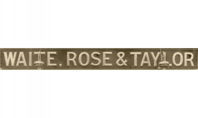
The original name of the brand was Waite, Rose & Taylor, which was reflected by the earliest Waitrose logo. It was more of a simple sign rather than a real logo, though.
There was nothing but the lettering “Waite, Rose & Taylor” set in a generic sans. The letters had classic proportions and didn’t bear serifs. Due to this, the logo would have looked modern even now, if not for the old-style long name of the company.
1908 – 1911
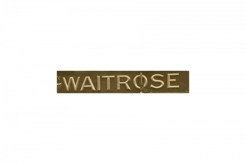
You might be surprised if you compare this version to the current one! Now that the brand’s name was shortened to “Waitrose,” the logo already had a totally modern style – clean and minimalist. However, it was probably not because the designers had a futuristic vision but due to the materials (the letters on the sign were made of metal).
1911 – 1927
An updated version of the Waitrose logo looked flat. In addition, it had letters stretched out vertically, which changed the look of the emblem without any drastic modifications.
1927 – 1938
The new logo looks very elegant and sophisticated thanks to the addition of serifs and fancy font style. At the same time, it had a lot in common with the previous logos as there were no other elements besides the name printed using all uppercase letters.
1938 – 1955
The extravagant font was replaced by a simpler typeface. It had no serifs and had a three-dimensional appearance similar to the 1908 logo. A unique feature of this logo was a triangular letter “O” and letter “A” that had its top off the center. All the letters stayed uppercase.
1955 – 1969
The clear type was replaced by a more refined serif one.
1969 – 1987
The letters grew much bolder. The serifs on the lower parts of the glyphs looked like platforms. The proportions were modified (the glyphs became more elongated).
1987 – 2004
The type lost some weight but preserved its elegant serif style with strokes of varying thickness.
2004 – 2018
The new Waitrose logo was developed by Monotype Imaging, a US company specialized in digital typesetting and typeface design, and Interbrand, a division of Omnicom, is a New York-based marketing consultancy.
In line with modern design trends, the new wordmark didn’t have serifs. The glyphs were clear and had classic proportions. Only the initial was capitalized. In spite of the standard proportions and overall shape, the glyphs had a couple of unique details (note, for instance, the top of the “t” and the “r”).
Another way to make the design recognizable was the choice of the color – a warmed (yellowish) shade of green. Also, it echoed the company’s focus on its positioning as ethical (taking into consideration the Fairtrade produce, for instance).
2018 – Today
The Waitrose logo preserved its green color but made it slightly darker. The unpretentious sans is capitalized and looks pretty much like that on the 1908 logo, with several minor modifications (the equal bars on the “E” and the smaller top half of the “R,” to name just a few). The lettering “& Partners” was added below.
In addition to the wordmark, there is also a more complicated alternative version. Here, the writing is placed inside a green rectangle, and there are three stripes in various shapes of green. They are placed either to the left or below the rectangle.
Font
The typeface looks similar to the Futura BQ Book font, although the glyphs are customized (for example, the letter “t”). The sans serif font was created by Paul Renner and published by the Berthold type foundry.
Color
The 2004 rebrand included a completely new color scheme. From then on, the Waitrose stores have been using a distinctive shade of yellowish green.


