VTC14 is the name of one of the most popular Tv Channels in Vietnam, which was established in 2009 and by today has already gained more than a million audience due to its high-quality content and professionalism.
Meaning and history
The visual identity of the VTC14 channel is elegant and simple. Based on a delightful yet calm combination of green and white colors, the logo of the channel evokes a sense of success and growth, and showing the brand from its best side, representing confidence and progressiveness.
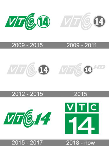
2009 – 2015
The initial logo for the channel was introduced right after its launch, in 2009, and featured a simple yet modern and stylish composition with the white letters “V” and “T” slanted and placed on two green parallelograms, on the left from the stylized “C”, formed by a double green circle and two curved lines, and the strict and bold “14” enclosed intro a circular frame. All the elements of the logo were executed in solid and intense green and placed on a white background. The logo was also available in a gray color palette if there was a need to place it on a dark background.
2009 – 2011
2012 – 2015
2015
2015 – 2017
The redesign of 2015 was about the “14”, as all the other elements were kept in their original state — two green parallelograms with white letters on them, a playful “C”, drawn in two lines and two circles, and the official green and white color palette. As for the numbers now it was written in more elegant lines and got a slight inclination. The circular frame was removed, and the digits were enlarged, becoming more visible.
2018 – Today
In 2018 the Vietnamese tv-channel simplified its visual identity, adding a modern and strict touch to its green and while tiki. The new composition boasts two levels with the “VTC” written in white on three green squares, placed above the enlarged solid green rectangle with a bold white “14” written on it in straight lines with clean and neat contours.


