Neither the current Virginia Tech Hokies logo nor the previous ones have in any way alluded to the university’s mascot, HokieBird.
Meaning and history
The inception of the Virginia Tech Hokies, a symbol of athletic vigor and excellence, traces back to the foundational years of Virginia Polytechnic Institute and State University in 1872. This legacy began with the university’s establishment, intertwining with its growth and evolution. Over the decades, the Hokies have carved a niche in collegiate sports, particularly noted for their formidable football team. This team, a beacon of the university’s athletic spirit, has triumphantly secured several conference championships and prestigious bowl game appearances, etching its name in the annals of sports history.
The journey of the Hokies is also marked by the achievements of their basketball teams, both men’s and women’s, who have made significant strides in NCAA tournaments, showcasing skill and determination. The Hokies’ sports saga is further enriched by intense rivalries, especially with the University of Virginia, adding a dynamic edge to their athletic endeavors.
Presently, the Virginia Tech Hokies stand not merely as a sports entity but as an emblem of the university’s ethos of resilience, teamwork, and sporting excellence. Their sustained prominence in top-level athletic competitions cements their status as a powerhouse in the realm of college sports. This enduring legacy continues to shape the university’s image, drawing aspiring athletes and sports enthusiasts nationwide to its campus.
What is Virginia Tech Hokies?
Virginia Tech Hokies is the name of a college football club from Virginia Polytechnic Institute. The club played its first season in 1892 and today it is coached by Justin Fuente and competes in the Football Bowl Subdivision.
1966 – 1971
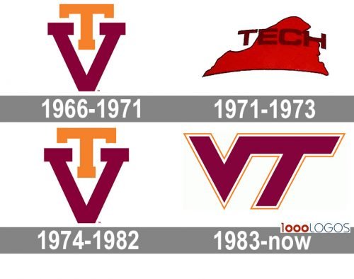
The badge created for the team in 1966 was composed of two bright letters — “T” and “V”. The “T” was a bit smaller and drawn in an intense orange shade. It was placed above the enlarged and slightly extended “V” in a calm and dark burgundy color. The letters were executed in clean straight lines with distinct ended and right angles.
1971 – 1973
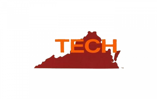
The redesign of 1971 has completely changed the style and concept of the club’s logo. This time it was a composition in two shades of red — with the classy intense red for the background and the dark burgundy one for the bold sand-serif “Tech” inscription placed over its.
1974 – 1982

In 1974 the club returned to its logo from 1966, slightly refining its contours, and making both letters a bit bigger and wider than they were in the original version. The color palette remained untouched and the position of the letters as they were, but the lines became bolder and cleaner.
1983 – Today
The nickname “Hokie” comes from a spirit cheer created by a student named O.M. Stull in the 1890s. Before that, the players of the university’s athletic program were nicknamed the Gobblers.
The current athletic logo (since 1983) of the Virginia Polytechnic Institute and State University features the letters “V” and “T” in maroon with white and burnt orange trim. The letters are positioned next to each other, while their ends merge into one another.
Virginia Tech Hokies Colors
CHICAGO MAROON
PANTONE: PMS 208 C
HEX COLOR: #630031;
RGB: (99, 0, 49)
CMYK: (41, 100, 56, 48)
BURNT ORANGE
PANTONE: PMS 158 C
HEX COLOR: #CF4420;
RGB: (207, 69, 32)
CMYK: (13, 87, 100, 3)


