Viber is the name of the messenger, created in 2010 for mobile devices. Today the software is available for both Android and iOS operating systems and has its versions for Windows and Linux. The messenger has more than one billion users across the globe.
Meaning and history
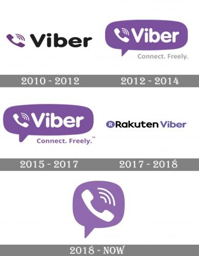
Even after the acquisition by Rakuten, Viber kept its loyalty to the original style and color palette of the visual identity, set at the very beginning of the brand’s history, in 2010. Though the logo of the app was changed several times, if you look at the initial emblem, and at the current one, their similarities will be obvious.
What is Viber?
Viber is a program through which you can make free online calls and send messages. It can also be used to transfer photos, documents, and other files.
2010 – 2012
The original Viber logo featured a black rounded sans-serif logotype placed on the right from a delicate purple emblem, depicting a handset and three arched lines. The diagonal disposition of the emblem made the logo look friendly and playful, while the bold inscription added professionalism and confidence.
2012 – 2014
The redesign of 2012 made both elements of the logo while and placed them on a purple background color which had a contour of a word-cloud. The light “Connect. freely” tagline in a traditional sans-serif typeface was placed under the emblem, on its right part.
2015 – 2017
The emblem became enlarged in 2015, and the tagline changed its color from gray to purple in the same year. The logo started looking brighter and more intense, reflecting the progressiveness of the brand. The first square icon was introduced in the same year. The white handset with three lines was placed on a purple background. The square had its angles rounded and was available in several versions — plain, gradient, and outlined.
2017 – 2018
The app was bought by Rakuten in 2017 and the logo was redesigned in the same year. The rounded sans-serif “Viber” logotype was drawn in purple and placed on the right from a traditional “Rakuten” inscription in black. The solid purple circle with a white “R” on it was set on the right from the logotype, pointing to the affiliation of the app to the company.
2018 – Today
 Both parts of the logo started to be written in purple in 2018. The circular Rakuten emblem was replaced by an iconic diagonally set handset in a word-cloud, executed in purple and white. The “Rakuten” lettering is now underlined by a sharp element, which adds strength and energy to the image. As for the Viber icon, it uses the same symbol as the official emblem of the app, and available in two variants — drawn in white on a purple square, or executed in purple lines and placed on white.
Who owns Viber?
Since 2014 Viber is owned by the world-famous Rakuten Group, a Japanese giant, which operates on the international market since the end of the 1990s.
Font and color
The logotype of the famous application uses two different fonts for its composition, the strict and strong one for Rakuten, which looks very close to Mazzard H Semi Bold, and a smooth rounded sans-serif of the Viber part, pretty similar to VAG Rounded family fonts.
The purple and white color palette of the Viber visual identity is a representation of freedom, unity, and creativity. The combination of these colors brilliantly represents the purpose of the application and shows it as a reliable and strong one.
What is the Viber app?
Viber is an application for online voice and video calls, which is bind to your actual phone number. The application is available for various operating systems and can be installed on your mobile phone or tablet.


