Very is an online retailer based in the United Kingdom, founded as part of the Shop Direct Group. The current owner, The Very Group, specializes in consumer goods such as clothing, electronics, and home products. The company operates predominantly in the UK, providing services through its integrated online platform, which allows customers to shop a variety of products from their own homes.
Meaning and history
Very was originally established under the name Littlewoods Direct in 2005, as a subsidiary of Shop Direct Group. The founder, Sir Frederick Barclay, aimed to modernize traditional retail through the adoption of e-commerce, transitioning from catalog shopping to a dynamic online store. By 2009, Littlewoods Direct was rebranded as Very.co.uk, marking a shift towards a more inclusive and trendy online retail format.
The company quickly gained traction in the competitive e-commerce market by leveraging celebrity endorsements and engaging marketing campaigns. Significant achievements include pioneering a customer-friendly payment system that offered “buy now, pay later” options, which significantly boosted its market presence and customer base. Additionally, Very was among the first UK retailers to integrate fully with major social media platforms, enhancing its outreach and sales strategies.
Currently, Very stands as a prominent figure in the online retail sector, continuously evolving with technological advancements and consumer preferences. Its adaptability and innovative approach have secured a strong position in the market, with ongoing expansions into new product lines and international shipping options.
What is Very?
Very is an e-commerce company focused on providing a wide range of consumer goods, from fashion to electronics. It operates primarily online, serving customers across the United Kingdom with convenient shopping solutions.
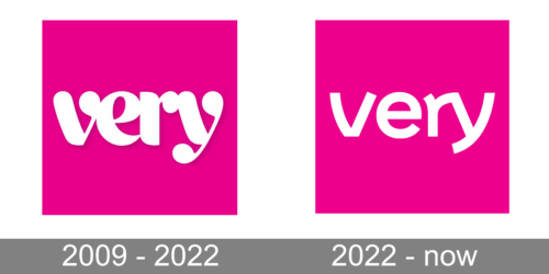
2009 – 2022
The first logo is characterized by a vibrant pink background that immediately catches the eye. At the center is the word “very” written in a playful, cursive script that suggests a sense of fun and approachability. The ‘v’ and ‘y’ have elongated tails that add a whimsical touch, and the ‘e’ and ‘r’ nestle comfortably in the center. The white color of the text provides a striking contrast against the pink, making the brand name stand out prominently. This logo appears modern and is likely targeted at a young, style-conscious audience. The simplicity of the color scheme and the font choice conveys an effortless charm and suggests that the brand is confident, friendly, and on-trend.
2022 – Today
The new logo, while using the same word “very,” presents a more subdued approach with a flat, minimalist design. The background retains the same vibrant pink, which signifies the brand’s energetic and youthful appeal. The word itself is in a sans-serif font that is clean and modern, indicating a straightforward and contemporary brand image. Unlike the previous logo, the letters are evenly spaced and aligned, contributing to a sense of order and precision. This design speaks to a brand that values clarity, efficiency, and modernity. It suggests a connection with an audience that appreciates a straightforward, no-frills approach to branding, where the focus is on clarity and usability.


