Myntra is the name of the most popular e-commerce platform in India, which was founded by Mukesh Bansal, Ashutosh Lawania, and Vineet Saxena in 2007. The company is owned by Flipkart since 2014.
Meaning and history
Myntra is a large Indian online clothing and accessories store that has been operating since 2007. In 2013 Myntra received the award as the “Fashion Store of the Year 2013” from Franchise India, and after that was acquired by Flipkart. In May 2018, U.S. chain Walmart acquired a 77% stake in Flipkart in competition with Amazon in the Indian market.
Myntra is an undoubted leader in the Indian e-commerce market, but the company operates not only in its country but worldwide, with its website fully in English and international delivery services available on the platform.
What is Myntra?
Myntra is the Indian e-commerce leading platform, which was established in 2007, and was acquired by Flipkart in 2014. The online-shopping company operates mostly through a mobile app and constantly expands the range of its services, available to customers.
2007 — 2011
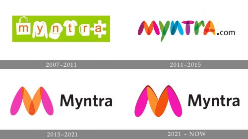
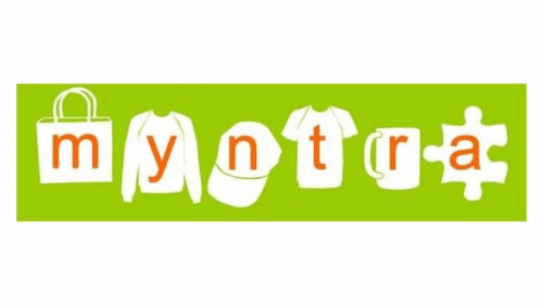
The very first Myntra badge was introduced in 2007 and stayed active for four years. It was a pretty naive and amateurish badge, full of different images, and using not the most professionally looking color palette. It was a bright green background with six white images set in one horizontal line: a bag, a sweatshirt, a cap, a t-shirt, a cup, and a puzzle; and each of the white symbols had one of the letters of the “Myntra” name written on it in dark orange. The logo was meant to reflect the wide variety of products, offered by the platform.
2011 — 2015
The redesign of 2011 has introduced a completely rethought logo for the Indian e-commerce platform. The new concept was composed of stylized colorful lettering, with each glyph formed by overlapping semi-transparent elements, with shades from pink to orange. The stylized logotype was set against a white background and followed by a small black “.com” in a simple serif font.
2015 — 2021
In 2015 the Myntra logo was redesigned again, taking the idea from the previous badge and making up an emblem out of it. The new concept was built around the enlarged stylized letter “M”, formed by four smooth and bold elements in orange and pink, placed against a white background on the left from the black title case logotype in a modest sans-serif typeface.
2021 — Today
The redesign of 2021 has strengthened and stabilized the Myntra badge, keeping the idea of the previous logo, but intensifying the colors of the emblem, removing the overlapping areas, and accenting more on the top lines of the stylized “M” by adding some darker outlines to the peaks. As for the lettering part, it remained untouched, being set in the same style and size as on the age from 2015.
Font and color
The bold and pretty modest title case sans-serif logotype from the official Myntra badge is set in a stable bold typeface with geometric contours of the letters. The closest fonts to the one, used for the Myntra insignia, are, probably, News Gothic BT Std Bold and Texicali Bold.
As for the color palette of the Myntra visual identity, it is set in a combination of orange and pink, accompanied by black for the lettering. The scheme of the emblem evokes a sense of energy and love, reflecting the approach of the company and its values. As for the black inscription, it elevates the professionalism and confidence of the company.


