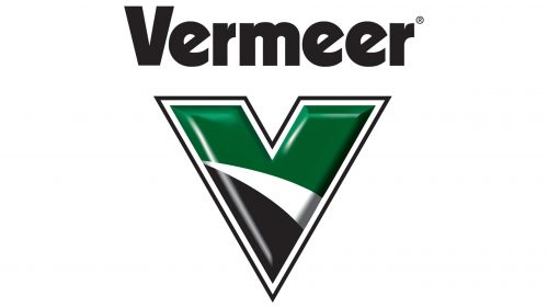
The logo of Vermeer Corporation was inspired by the company name. While the design has changed during the company’s more than 75-year history, it has always had the letter “V” at its centerpiece.
Meaning and history
Vermeer specializes in manufacturing industrial and agricultural equipment. The company was founded in 1943. It is based in Pella, Iowa.
1986 – 2004
The old Vermeer logo featured a strong and young worker wearing a helmet and plain clothes. He was rolling up his sleeves. The worker’s torso appeared out of a large letter “V.” The lettering “Vermeer” could be seen above. Here, only the initial was capitalized. Interestingly, it had different proportions than the large “V” below. The type would have been a pretty generic bold sans if not for the unusual “e’s” where the horizontal bars had been replaced by diagonal ones.
2005 – Today
The “V” has been moved to the forefront. The worker has disappeared, due to which the design has grown cleaner. While the old logo was flat, the current one has a pronounced 3D effect to it, which can be clearly noticed in the white highlights and dark shades.
The majority of the surface of the “V” is occupied by dark green. In addition to it, there are also white and black fields and white and black trim.
While the “V” emblem can be used on its own, it is also often paired with the word “Vermeer” featuring the same type as in the previous emblem.


