The logo of the investment company Vanguard remained unchanged for almost half a century until the brand eventually decided to simplify it.
Meaning and history
Vanguard is a global financial services corporation serving more than 23 million investors. The main focus of the company is the management of mutual funds and ETF funds, but its activities are much broader. In total, the corporation has more than 5 trillion U.S. dollars in its accounts, which is the second result in the world after BlackRock.
The Vanguard Group was founded by John Bogle on May 1, 1975. It is noteworthy that his father was also a businessman, but he was less fortunate than his son – he went bankrupt. And the son will choose the name and symbol of his company in honor of the last battleship of the British Royal Navy, which had high speed and modern equipment.
The name of the company characterizes it as a progressive and constantly moving one, showing growth and development as the main values of the American company.
What is Vanguard
The Vanguard Group, Inc. is a registered investment advisor headquartered in Malvern, Pennsylvania, US. The volume of assets under management exceeds $6.2 trillion (2020).
1975 (1981) – 2020
To fully understand the Vanguard logo, you may need a quick glimpse at the history of the company.
Vanguard was started in 1975 by John C. Bogle as a new fund division at Wellington. Bogle chose the name Vanguard as an allusion to HMS Vanguard, which was the flagship of Vice-Admiral Horatio Nelson at the Battle of the Nile (August 1798). The name of the ship means “in the forefront,” which perfectly reflects the core promise of the investment firm established by Bogle.
According to an explanation given by the company, the fund was based on a plain yet revolutionary concept that a mutual fund ought not to have outside owners. In other words, Vanguard was created as a client-owned company. This approach resulted in lower investment costs.
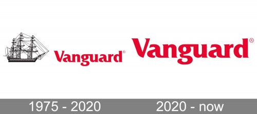
Taking into consideration the information above, you can easily see why the company adhered to its original logo for so long. The design, which showcased the iconic flagship, was an embodiment of the brand’s spirit and its core promise. The vessel was depicted rather realistically, in full detail, with all those masts and rigging.
2020 – present
While the Vanguard logo might have looked fine for the 1970s, it started to look dated over time. New, minimalist designs sprouted up replacing elaborate, detailed images. As a result, the glorious flagship now appeared too cluttered. Nevertheless, the company’s top executives continued to stick to the original design as they couldn’t afford to lose touch with the brand’s rich heritage.
Yet, eventually, in the fall of 2020, the ship sailed, literally. Initially, there seemed to be no official comments, yet many clients noticed that the HMS Vanguard was lacking from printed documents and much of the website. Moreover, those who had been most attentive might have noticed that the brand had been moving away from this emblem for several years by then.

Eventually, the company explained that earlier that year they had collaborated with a branding agency with the purpose of modernizing the visual brand identity. They came to the conclusion that it was time to get rid of the ship altogether.
The decision seems pretty logical as the name and the way the vessel is depicted appear somewhat ironic when juxtaposed against each other. However, some sources also cite the following reasons:
- the current top executives wanted to separate themselves from the founder after his death in 2019;
- the company strived to distance itself from another ship which also bore the name Vanguard but was used as a slave ship. In this respect, it is interesting to mention that the brand’s spokesperson explicitly stated that HMS Vanguard, after which the company was named, “wasn’t involved in the slave trade.”
The new Vanguard logo features only the wordmark, so, conversely, it is quite sleek in comparison with the old two-part logo. If not minimalist, it is still easy to grasp and dynamic.
Colors and font
The brand has stayed loyal to the maroon color as the main color of its logo. It looks respectable and noble, yet isn’t devoid of inner energy. It is in fact close to the shade of dry blood, which may cast a sinister shadow on the image.
The type is refined and conjures classic elegance due to the artistic variations in the widths of the strokes and the elaborate serifs.


