Halifax is the name of the banking company from the United Kingdom, which was established in 1853 and today is owned by one of the largest banking corporations — Lloyds. The company specializes in providing banking and insurance services.
Meaning and history
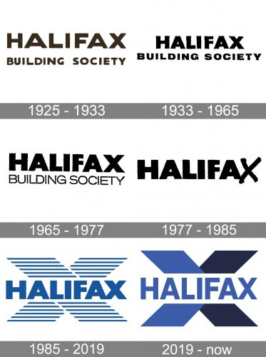
The Halifax logo history can be easily split into two periods — until 1977 and after 1985, with eight years in between, when the emphasis has been moved to the right place. These were the years when the letter “X” became the main theme of the bank’s visual identity.
What is Halifax?
Halifax is a British bank, which operates all over the UK, and is a subsidiary of Lloyds Bank, one of the world’s most reputable financial companies.
1925 – 1933
The initial Halifax logo featured a simple and strict inscription in two lines, with the “Halifax” in the uppercase set on the top level in an ExtraBold sans-serif typeface with modern shapes of the letters, and the “Building Society” in smaller size and the same font. The lettering was executed in a dark chocolate shade and placed on a light cream background. This color palette looked warm and cozy and evokes a sense of care and reliability.
1933 – 1965
After the first redesign, the color palette of the company’s visual identity was changed to black and white, a traditional combination that stood for professionalism and stability. The typeface was also changed and lettering became more intense, with all characters being placed closer to each other.
1965 – 1977
In 1965 the logo was rewritten once again. Now the bottom line of the inscription was executed in a lightweight sans-serif, while the “Halifax” on top got its lines even bolder and heavier than on the previous emblem. The badge looked balanced and modest, evoking a sense of confidence and responsibility, and showing the traditional and fundamental approach of the company.
1977 – 1985
The redesign of 1977 introduced a new concept of the Halifax logo. The tagline was gone and now it was the single wordmark in black set on a white background and executed in the uppercase of a geometric sans-serif typeface with heavy and massive letters. The last “X” was hand-drawn in smooth elongated lines, adding uniqueness and playfulness to the whole badge and showing the ability of the company to change according to the needs of its clients and the latest banking tendencies, expanding the portfolio of its services.
1985 – 2019
The new color palette was adopted by Halifax in 1985. It was a combination of blue lettering on a white and blue background. The color scheme, standing for reliability, confidence, and trustworthiness. The background featured an enlarged letter “X” drawn in several horizontal blue lines. As for the logotype, it featured bold massive letters in blue, written in a progressive yet pretty strict sans-serif typeface.
2019 – Today
With the redesign of 2019, the color palette of the Halifax logo was expanded and one more shade of blue was added to the composition. The striped “C” was replaced with a solid one, with one diagonal in a lighter blue, and another — in a darker shade. As for the wordmark, it was set on a white background in the lighter shade, executed in a medium-weight sans-serif typeface with clean lines and distinct cuts of the ends.


