Valio is a renowned Finnish dairy company, best known for its innovative dairy products and solutions. With a heritage rooted deeply in Finland, it has expanded its reach, serving markets across Europe, Asia, and beyond. The company stands out for its commitment to sustainability and top-quality products, ranging from cheeses to yogurts and milk powders. Valio is cooperatively owned by Finnish dairy farmers, ensuring that the benefits flow back to the local agricultural community. Emphasizing health and nutrition, Valio continues to be a leader in the global dairy sector, consistently pushing the boundaries with research-driven products.
Meaning and history
Valio, a luminary in the dairy world, began its journey in Finland in 1905. It was initiated by 17 dairy cooperatives with a shared vision to refine and advance the dairy production process. This collaboration not only improved the quality of dairy products but also enhanced the Finnish dairy industry’s reputation abroad.
Through the 20th century, Valio expanded both in terms of product variety and technological innovations. While butter and cheese were initial successes, Valio soon branched into other dairy products, capturing a larger share of the market. The company was a trailblazer in introducing lactose-free products, addressing the needs of lactose-intolerant consumers, a move that positioned them as a global leader in this niche.
Ownership of Valio remained largely unchanged, being a cooperative and owned by Finnish dairy farmers. This ownership structure ensured that profits were reinvested into improving dairy production methods, benefitting the very farmers supplying the milk. This unique model fostered loyalty and ensured a consistent supply of high-quality raw materials.
One of Valio’s most significant contributions to the dairy industry was the introduction of the Eila lactose-free process, which became a gold standard worldwide. Furthermore, the company’s R&D efforts have consistently yielded dairy products that cater to modern nutritional needs, ensuring Valio’s reputation as a pioneer.
Over the decades, production underwent significant transformations. From traditional methods to adopting state-of-the-art technologies, Valio ensured that its products met international standards. Additionally, the company expanded its footprint beyond Finland, exporting to European neighbors and eventually to Asia and the Americas.
Today, Valio stands as a testament to consistent innovation, dedication to quality, and an unwavering commitment to the dairy farmers who have been at the heart of its century-long journey. This Finnish giant, while rooted in tradition, looks forward to the future, ready to shape the global dairy industry’s next chapter.
1944 – 1991
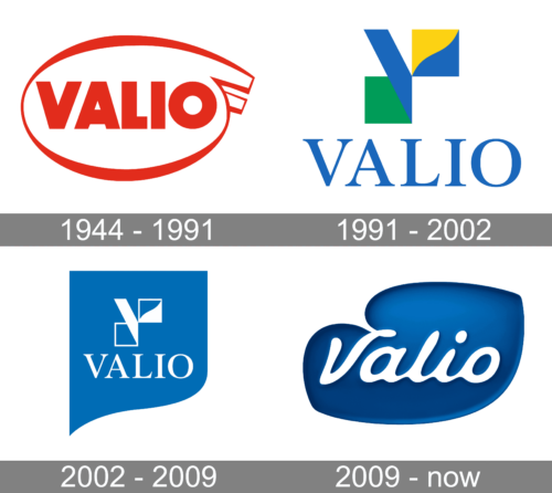
The emblem exhibits the brand name “VALIO” in bold, block-style, fiery-red letters. The capital letters are large and uniformly spaced. The design incorporates a vibrant red, semi-circular line that arcs over the word “VALIO”, starting from the top left corner and curling around the bottom, only to rise again and terminate with a distinctive, circular loop on the right. This loop, adjacent to the letter ‘O’, adds an element of intrigue to the overall design. The way the red lines flow suggests dynamism, adding a zestful energy to the logo’s static typography.
1991 – 2002
The logo prominently displays the brand name “VALIO” in a striking shade of royal blue with classical, serif typography. Above the text, an abstract, geometric motif captures the viewer’s attention: it comprises an interplay of three shapes. A deep blue triangular shape leans towards the right, intersecting with a vibrant yellow right-angled triangle, the two of which form a semblance of a stylized “V”. Adjacently, there’s a rectangular shape, bifurcated diagonally, with the top half in the same vivid yellow and the bottom half in a fresh shade of green. This trio of shapes together evokes a sense of modernity and dynamism, striking a harmonious balance with the traditional typeface beneath. The overall design exudes a sense of elegance intertwined with innovative flair.
2002 – 2009
The logo is set against a vivid cerulean background, showcasing a modern and sleek design ethos. It features the capitalized word “VALIO” placed centrally in a bright white hue, rendered in an elegant sans-serif typeface. Just above this text, an intriguing geometric emblem commands attention: a stylized letter “V” constructed from two interlocking shapes. The first is a white triangle pointing to the right, while the other, an L-shaped design, encapsulates the triangle’s top right, leaving a triangular negative space. The entire design, with its clean lines and minimalist aesthetic, is bordered by a gently curving white perimeter on the right, which adds a touch of dynamism and fluidity to the otherwise static presentation. Overall, the logo radiates a harmonious blend of simplicity and sophistication.
2009 – Today
The logo showcases the word “Valio” rendered in flowing, white script font against a rich cobalt blue background. The first letter, “V”, is slightly detached from the subsequent letters, and its tail swoops gracefully, adding an artistic flair. The lettering has a fluidity, reminiscent of a liquid or creamy substance, emphasizing the dairy industry’s nature. To the lower right of the word “Valio”, there’s a white dot, which could symbolize a drop, further reinforcing the liquid theme. The overall blue backdrop has an abstract, rounded shape with undulating edges, imparting a modern and organic feel to the design.


