Valentino is one of the best-known clothing companies in Italy. It was established in 1960 by Valentino Garavani. Today, it belongs to the State of Qatar through Mayhoola. While the headquarters are located in Milan, the creative direction is in Rome.
Meaning and history
Stylish and simple, the Valentino logo possesses the timeless elegance characteristic of the brand itself. As the design is not loaded with details, there is no need to update it no matter how different the style of the collections introduced by Valentino can be.
The name of the brand features a serif type with classic proportions. The combination of bold and thin strokes adds an elegant touch. Typically, the wordmark is used on its own but it can also be combined with the “V” symbol, which is placed above.
The overall style of the logo is somewhat similar to that of the Giorgio Armani logo, although the proportions of the glyphs are different.
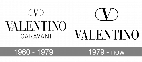
1960 – 1979
While the company decided to get rid of the founder’s second name in the current Valentino logo, you can still come across an older logo featuring the word “Garavani.” It was given in a lighter, less noticeable type. The letters were smaller than those used for the word “Valentino.” Also, while the word “Valentino” featured the same type as it does today, the lettering “Garavani” was given in a sans serif font.
1979 – Today
After the redesign of 1979, the iconic Valentino badge was slightly refined and simplified, as the “Garavani” underline was completely removed from the composition. Another change was made to the emblem, — it got enlarged, creating a very balanced look with the wordmark, which hasn’t changed at all.
Symbol
In addition to the wordmark, the company often uses a pictogram. Here, you can see a stylized letter “V.” The serifs have been extended to form an open ellipse going around the glyph. The letter itself looks pretty much like the initial of the wordmark.


