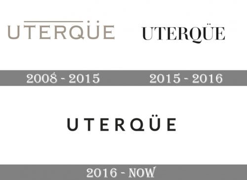
Since 2008 when the fashion brand Uterqüe was founded, it has gone through at least two logo updates.
Meaning and history
The brand specializes in making fashion accessories and garments such as scarves and sunglasses. It belongs to the Spanish Inditex group.
Uterque is a Spanish brand of women’s clothing and accessories in the mid-price segment.The fashion brand was founded in 2008 in Galicia, the same region of Spain where Zara is from. Indeed, Zara and Uterque belong to the same company, Inditex.
As for the name, Uterque is a Latin word that literally means “Both”. The idea of the brand is to attract a woman who has already seen everything and who appreciates quality and the latest trends in fashion.
The brand launches limited collections and produces clothes that are distinguished by high quality and durability. Uterque is known for its exclusive clothes that emphasize a strict silhouette and unique accessories.
Initially, the brand focused mainly on accessories, but every year the company has been devoting more and more time and effort to creating collections of women’s clothing.
What is Uterque?
Uterque is the name of a Spanish fashion brand, which was established in 2008 by the famous Inditex Group. The brand is specialized in the production of stylish accessories and clothing for women in the middle-price segment.
2008
The original version was by far more elaborate than the current Uterqüe logo and had a glamorous touch because of its gold color.
While the type was a serif one, the word “serifs” cannot describe the elegant, refined elements seen on the ends of the letters forming the wordmark. Also, there was a horizontal bar above the company name.
2015
For a couple of years, the company used a logo in a simpler type. While it was also a serif type, it did not have the unique decorative style of its predecessor. The “tail” of the “Q” was pretty distinctive, though.
2016
The current Uterque logo showcases the name of the brand in a completely different font. It is by far simpler and more minimalist sans serif type with generous space between the glyphs. What makes the design stand out among its competitors is the unusual shape the tail of the “Q” has. While it is not as elaborate as the previous one, it is still distinctive and perfectly fits the overall style of the wordmark.
Font and Color
The bold and stable uppercase lettering from the primary Uterque badge is set in a heavy geometric sans-serif font with modern contours of the characters and distinctive cuts of the lines. The star of the inscription is the stylized letter “Q”. The closest fonts to the one, used in this logo, are, probably, Alilato Arabic Bold, or Blackpast Regular, but with the elements slightly modified.
As for the color palette of the Uterque visual identity, it does not vary from most of the fashion brand badges and uses a simple yet 100% efficient combination of black and white, which always looks actual and elegant.


