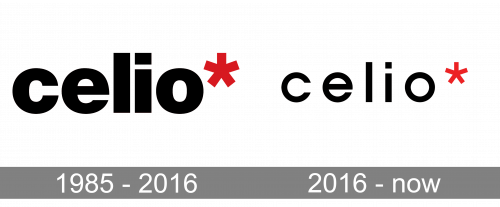
Although the Celio logo has undergone several updates, it has preserved its structure including the name of the brand and the distinctive five-pointed asterisk.
Meaning and history
The company was established in 1985. Its history started from a women’s ready-to-wear boutique named CLEO 3000. Today, the brand has over 1100 stores in more than 50 countries
1985 – 2016
The previous version of the Celio logo featured a bolder type with less space between the letters. This emblem did not look as light and airy as the current one.
2016 – now

Later, they reduced the boldness across the logo, and that applied both to the letters and to the asterisk symbol in the corner. Everything else stayed the same, including the intervals between the letters.
Emblem
The current logo features the word “Celio” in an unpretentious sans. All the letters are lowercase and rather light. The most unusual part is probably the “e” with its end almost touching the side. As a result, it almost forms a ring. Also, the dot above the “i” is not a dot but a square.
What makes the design distinctive is the red asterisk placed to the right of the word “Celio.” The asterisk makes the logo look as if there is a footnote somewhere. It makes us think we need to look for additional information, which adds the design an unusual touch. Also, this small bright accent helps to create a memorable emblem.


