US Airways is one of the most reputable and respected airlines in the USA. The company was founded in 1979 as USAir and changed its name to US Airways in 1997.
Meaning and history
US Airways was one of the five largest airlines in the U.S. and a member of the Star Alliance Association. The company operated flights to over 200 destinations. The main destinations were Central and North American cities, as well as Europe.
The company’s founders are considered to be the DuPont brothers, who in 1939 registered the brand. At that time, the company’s headquarters was located in Pittsburgh. In the process of development the company was constantly changing, absorbing all new smaller companies and constantly changing its name. As a result of constant mergers, in 1972 it became the 6th largest airline in the world in terms of passenger traffic. In the 1980s, the company acquires several new Boeing 737s.
In the early 1990s, the company opened regular flights to the largest airports in Europe. In 2005, the air carrier merged with America West Airlines, which significantly strengthened the airline’s position in the passenger airline market of America. ten years after, in 2015, US Airways merged with American Airlines, creating the biggest air carrier in the world.
What is US Airways?
US Airways was the fifth largest air carrier in the United States. The company was established in 1939, and merged with American Airlines in 2015, becoming the largest airlines in the world. The new airline has more than 950 aircraft in its fleet. Every day it operates about 6,5 thousand flights to 330 destinations in more than 50 countries of the world.
1979 – 1989
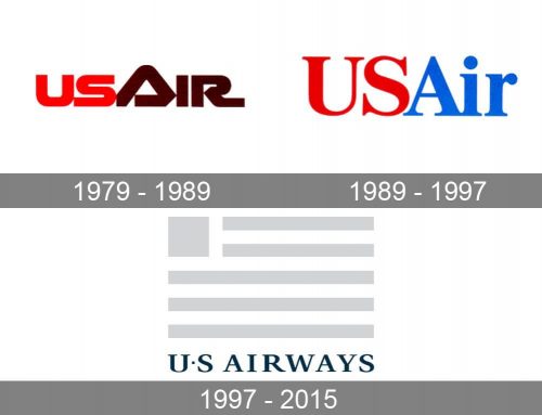
The very first US Airways badge was introduced in 1979 and stayed with the air carrier for almost ten years. It was very modern for its times’ lettering in a futuristic extra-bold sans-serif typeface, executed in all capitals with rounded angles and sharply cut diagonal ends of the lines. The central letter, “A”, was enlarged and drawn as a triangle, formed by a folded ribbon, rounded at its peak. The color palette of the logo was based on scarlet-red and brown shades, which looked very warm and welcoming.
1989 – 1997
The redesign of 1989 changed the color palette of the logo to a more patriotic red and blue one, and simplified the composition of the badge, by using only a serif logotype, with no designer elements. The “US” was set in bright red, while the “Air” in the title case was glued to the first part of the lettering and drawn in bright blue, adding vitality and energy to the badge and making it look professional and stable. This version of the logo was used for a hit less than the previous one — around eight years only.
1997 – 2015
One of the most known names among the world’s biggest airlines, US Airways has a perfect reputation and a strong visual identity concept.
The US Airways logo, designed in 1997 by Luxon Carrá and Deskey Associates, features a wordmark and an emblem, placed inside a long horizontal rectangular.
The wordmark is executed in a smooth and sophisticated serif typeface with a distinct line of all the capital letters. The “R” of the nameplate features an elongated tail, which looks elegant and playful at the same time.
In the “US” part of the wordmark, letters are divided by a small square, placed at the middle point of the inscription. It adds individuality to the logo, though it has the same color and strict simple shape.
The US Airways emblem is a stylized American flag, which is executed in five parallel horizontal lines and a solid square in the top left corner. It is a very strong geometrical representation of the national flag of the USA. Modern and recognizable.
The royal blue and gray color palette of the US Airways logo makes the company’s visual identity elegant and timeless. It is a reflection of a trustworthy and reliable brand, which is confident today and aims to keep its leading position tomorrow.
Font and Color
The bold and elegant lettering from the primary badge of US Airways is set in a heavy serif typeface with stable sharp tees written in thick bars and decorated by thin elongated serifs. The closest fonts to the one, used in this insignia, are, probably, Neftali Pro Regular, or Pescadero Pro Bold with some minor modifications of the characters’ contours.
As for the color palette of the US Airways visual identity, it is based on a deep and dark shade of blue, and a light tone of gray, which together make up a very confident and professional image of the company, evoking such feelings as excellence, stability and trustworthiness.


