While Air Mauritius was founded in 1967, it actually commenced operations only in 1972. The company is known as the flag carrier airline of Mauritius. Its headquarters are located in Port Louis, Mauritius.
Meaning and history
Air Mauritius was established in June1967. In addition to the government of Mauritius, Air France, and BOAC airlines participated in its creation. Subsequently, the first Air Mauritius flights were operated in partnership with these companies.
The first flight of the air carrier was not opened until 5 years after the creation of the airline. Only then did the carrier gets its first aircraft for its own use. Prior to that, the company’s main activity was ground handling of other airlines’ aircraft.The first Air Mauritius flight to Europe was opened in 1973, it connected Mauritius and London.
Today the company has flights to 26 international destinations and operates a fleet of 22 aircraft, most of which are Airbus.
What is Air Mauritius?
Air Mauritius is the name of the flagship airline of the State of Mauritius, founded in 1967. Air Mauritius has its head office and base airport in Port Louis. The state of Mauritius is an island, and the airline is its link with the rest of the world. Air Mauritius has a fairly large fleet compared to other African companies and maintains an extensive route network to many countries in Europe and Africa.
1972 – 2008
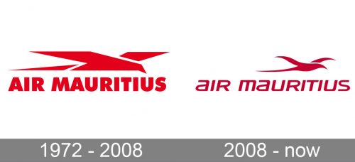
The Air Mauritius logo, designed in 1972, has stayed with the company for most part of its history. It was a bright red badge with the geometrically stylized bird, drawn in a shape of a plane, or plane, drawn in a shape of a bird, placed above the uppercase wordmark in an extra-bold modern sans-serif font, which looked stable, reliable, and solid.
2008 – Today
The bird that dominates the Air Mauritius logo is one of the most popular symbols in the logos of airlines. On the one hand, the bird is a symbol of flying, so it is a pretty obvious choice. But there also can be a deeper meaning to it. The bird is a symbol of not just any flight, but a natural and safe one. In this way, such a logo can be a way of fighting the passengers’ fear of flying on a manmade object.
Font and Color
The modern and stylish lettering from the primary badge of Air Mauritius is set in the mixed case of an extended sans-serif font, which is pretty close to such typefaces as Quub Bold Italic, or Vipnagorgialla Semi Bold Italic, but with some contours modified.
As for the color palette of the Air Mauritius visual identity, it is based on an intense crimson shade, which looks very elegant and progressive on a plain white background. This unusual choice of colors makes the air carrier stand out in the list of its competitors.


