Ursus, primarily known as an automaker, has a legacy rooted in manufacturing agricultural machinery. The ownership structure has evolved over the years, but it remains iconic in its sector. Based in Poland, Ursus has been instrumental in driving the country’s industrial advancement, providing robust machinery to cater to the agricultural demands of the region.
Meaning and history
Founded in 1893 in Warsaw, Poland, Ursus began its journey as a producer of exhaust steam engines before transitioning to tractors. Over the decades, the company made its mark as a leading manufacturer of agricultural machinery, significantly contributing to Poland’s agrarian landscape. In the mid-20th century, Ursus achieved global recognition, exporting tractors to several countries. However, economic challenges led to fluctuations in the company’s stability. As of today, while Ursus has faced financial constraints and restructuring, it remains a symbol of Poland’s industrial heritage and continues to influence the agricultural machinery sector.
What is Ursus?
Ursus is a Polish automaker with a history of producing agricultural machinery, especially tractors. Founded in 1893, it has played a crucial role in the industrial and agricultural development of Poland.
1893 – 1902
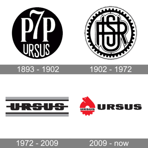
The P7P URSUS logo emanates a bold and contemporary aura. Dominated by the monochromatic color palette, it is deceptively simple yet profoundly impactful. The initials “P7P” are artfully intertwined, suggesting unity, strength, and continuity. These letters, mirrored about a central vertical axis, create an effect of reflection, highlighting symmetry and balance. The backdrop, a solid black circle, encapsulates the text, providing a sense of completeness. Below the initials, the word “URSUS” is displayed in capitalized, sleek letters, further emphasizing authority and significance. The typography chosen for both the initials and the word “URSUS” is robust and modern, conveying an image of a brand that is both forward-looking and rooted in tradition.
1902 – 1972
The logo is an emblem of intricacy and precision. Encased within a gear, it immediately invokes thoughts of machinery, engineering, and motion. The intertwined “USR” letters at the center seem like a testament to craftsmanship and detailed design. Their interlocked design suggests collaboration and interconnectedness, hinting at a brand that values unity and teamwork. The gear, with its well-defined teeth, encompasses the letters and represents mechanics, progress, and innovation. The black-and-white color scheme imparts a classic, timeless feel while emphasizing contrast and clarity. This logo could very well belong to a brand in the engineering, automotive, or tech industries, symbolizing a commitment to quality, precision, and advancement.
1972 – 2009
The second Ursus logo is a monochromatic delight, exuding an aura of sophistication and minimalism. The name “URSUS” is spelled in chunky, bold letters, sandwiched between two horizontal lines, giving it a grounded and stable appearance. The dark shades of the letters provide a sharp contrast against the light background, adding depth and dimension. The interconnected design of the letters, especially where the “R” and “S” meet, hints at unity, connection, and a sense of cohesiveness. Overall, this logo gives a nod to modern design principles while retaining a classic charm, making it versatile and timeless.
2009 – now
The Ursus logo stands out as a vibrant display of red and black, immediately catching one’s attention. The central emblem showcases the silhouette of a bear in a vivid red hue, encapsulated by a gear, signifying strength, resilience, and industrial prowess. The word “URSUS,” written in bold black capital letters to the right of the emblem, adds a sense of authority and recognition to the brand. The sleek, modern typography complements the emblem, providing a harmonious balance between the two elements. This logo, with its rich symbolism and contrasting colors, perfectly encapsulates a sense of power, progress, and legacy.


