

![]() University of Kentucky Logo PNG
University of Kentucky Logo PNG
University of Kentucky is a public research organization, established in 1865 and based in Lexington. This is one of the most prominent organizations in the educational structure of the state. Its operations are spread across 16 colleges. They manage the work of nearly 14000 faculty and staff, which lecture and examine around 250 academic programs in the fields of social sciences, liberal arts, and life sciences. The university is also known as a land-grant organization. It means that the students who distinguished themselves by some achievements related to science or education can count on land grants.
Meaning and history
![]()
The university’s first predecessor was established in the middle of 1860s. It was known as Agricultural and Mechanical College of Kentucky, a division of the university, which is now known as Transylvania University. Its core direction of study was related to biology and engineering. In 1867, the college disunited with the university. In 1908, the college’s organization was transformed, so it changed its name to ‘State University, Kentucky, Lexington’. However, the university staff retained this name for less than a decade. In 1916, the university was renamed as ‘University of Kentucky’.
What is University of Kentucky?
University of Kentucky is an American educational institution, established in 1865 and located in Lexington. This is one of the largest public research institutions, which plays an important role in the system of education in Kentucky and the entire USA. U of K offers people about 250 postgraduate and undergraduate programs. These programs include business, philosophy, informational disciplines, history and many others. They’re explored and lectured across 16 colleges, as well as numerous laboratories and academic centers. In total, there are 14000 faculty and staff personnel, which maintain the work of the university.
1865 – today
![]()
The UK’s seal composition has been designed of a ring with the name of the brand and the inscription with the ‘United we stand Divided we fall’ motto. Deeper in the seal, we can see an image featuring two men. One of them wears an animal’s coat and carries a shotgun. Another person is uniformed in an official style. Both men shake their hands and look straight at each other. Around them, we can see three notes with honorable years in the history of the university. The whole seal has a frame complied of many ovals joined to each other.
1865 – today
![]()
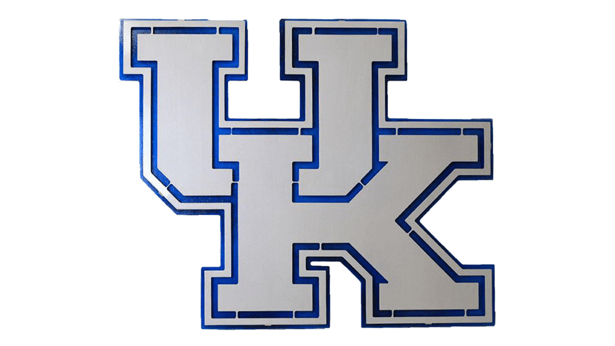
The logotype of the university represents the university’s nameplate, featured in two levels. It’s located to the right side from a styled ‘UK’ monogram.
Font

The fonts used in the two marks prepared for the University of Kentucky, as it often happens with such organizations, have a starkly diverging style. The seal version of the name is written using a bold sans-serif script with narrowed letters, which have small gaps in between. The whole inscription is executed in all capitals. The motto and the notes with the university’s memorable years use another script. It also features sans-serif characters with uppercase appearance, but also each letter has rounded tips.
As for the logotype, the name here has been composed of a slim typeface with thin serifs. The inscription is drafted in two lines. The lower part, ‘Kentucky’, has a bold style. The word occupies a lot of space in the logo, as it’s way larger than the upper part of the name, ‘University of’, which has a lightened font. To the left from the wordmark, we can see the ‘U’ letter intertwining ‘K’. This monogram has an angular script with heavy letters.
Color
The color schemes of the university’s two graphical images feature dissimilar palettes. The seal is painted blue and white, whereas blue is used for the lines, pictures, and words, while white stands for the background. However, we should remark that the white shade could be not used in the seal in specific situations. In the logotype, the black shade stands for the inscriptions. The monogram consists of blue symbols with white contours.


