While the history of the United Hockey League lasted around twenty years, it was renamed two times and spent only a decade under the name “United Hockey League.”
Meaning and history
1991 — 1997
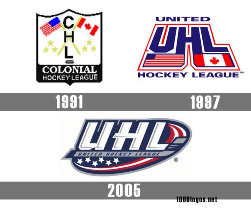
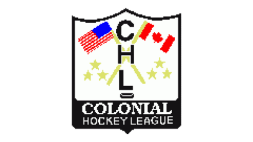
The original badge for the United Hockey League was created in 1991 when the name of the league slightly differed. It was a crest of a traditional shape, with a medium-thick black outline and emboldened bottom part, where the white wordmark in two levels was set. As for the main part of the crest, it featured a white background, where two flags, American and Canadian were drawn in straight lines, crossed. The handles of the flags and six five-pointed stars around them were executed in lime-green. Overlapping the drawing, a vertically oriented “CHL” abbreviation in black was written on the crest, ending up with a hockey puck. As for the inscription on the bottom part of the logo, it said “Colonial Hockey League” and had its upper level in a bold serif typeface, while the bottom one — in a medium-weight serif font.
1997 — 2005
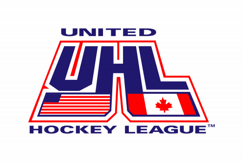 The earliest United Hockey League logo (1997) featured the letters “UHL” sloped backward with the US and Canadian flags below. The name of the league was given in two lines (above and below the main emblem).
2005 — 2007
In 2005, another UHL logo was unveiled. While the flags were gone, the emblem still preserved some of their symbolism in the color palette and pictorial elements (the stars and stripes, for instance).


