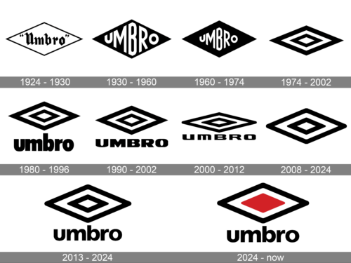
The logo of the major British sportswear brand Umbro has gone through around ten modifications over the previous 95 years. And yet, at least one thing has remained consistent in spite of all the updates – the rhombus (diamond) that has been part of the company’s brand identity ever since the first logo was introduced.
Meaning and history
Umbro is a British, primarily soccer brand founded back in 1920. The company was originally named after the founding brothers, Humphrey Brothers. The main engine of this company for many years became the eldest brother, Harald Humphrey; on his initiative, the company was renamed Umbro. Umbro is a kind of abbreviation, where Harald took two letters from “Humphreys”and three from “Brothers” and combined them.
In 1928 the players of Manchester City and Sheffield Wednesday club who later won the FA Cup began to wear Umbro clothes. And it became the perfect advertisement for the sports brand, which today is known all over the world first of all by its soccer uniforms.
What is Umbro?
Umbro is the name of a British brand of sportswear and accessories, which was established in the middle of the 1920s. The company, which today is owned by the European Iconix Brand Group, was founded by Harold and Wallace Humphreys.
1924 – 1930
The original Umbro logo already features the rhombus. Here, it is white with black trim. The word “Umbro” is placed inside. It is given in a retro script and has quotation marks from both sides.
1930 – 1960
The filling of the rhombus is now black, while the writing is white. It now features a custom sans serif type. The size of the letters is adjusted to better fill the rhombus.
1960 – 1974
The diamond is still black, and the shape of the letters looks the same as in the previous design. The glyphs have grown smaller, though.
1974 – 2002
This is the year when the now-iconic “double-diamond” logo was born. Here, there are two white rhombuses with bold black trim. The rhombuses are placed one inside the other.
1980 – 1996
The word “Umbro” in bold lowercase letters has been added below the double diamond. The glyphs stand pretty close to one another, which slightly damages the legibility.
1990 – 2002
The lettering has been capitalized and has grown wider. The space between the characters is now more generous, which makes the logo better legible even at smaller sizes.
2000 – 2012
The logo has grown flatter. Also, the letters have grown lighter. As a result, the company name has become hardly legible. The double diamond is still recognizable, though.
2008 – 2024
Experiments on the logo go on. This time, the design forces behind the brand decided to return the rhombus shape its original proportions. However, to retain the overall height of the logo, they got rid of the company name altogether.
2013 – 2024
Although the double diamond logo is widely recognized, in fact, for quite a few people it is not enough to identify the brand standing behind the logo. So, Umbro eventually decided to return the company name. They placed it below the design and chose a lowercase type. The shape of the glyphs reminds that of the 1980 wordmark but is not as bold as in the old version.
2024 – Today
The new logo is a color variant of the previously, adding a splash of color to the central diamond, which is filled with red. This addition of color captures attention and may represent passion, energy, and vitality—qualities closely associated with sports and athleticism. The red center also provides a focal point, drawing the eye directly to the heart of the logo. The use of red against the stark contrast of the black and white outer diamonds makes the logo pop, which is effective for branding on sports apparel and equipment where visibility is key. The word “umbro” remains consistent in style with the previously logo, maintaining brand recognition.
Alternative version (Joseph Walsh)
In 2013, graphic designer Joseph Walsh, who worked as an apparel designer at Umbro HQ, created a completely different Umbro logo. It featured the company name in an intricate interlaced script. The letters formed a diamond.
Font and Color
The heavy masculine lettering from the primary badge of the Umbro sportswear brand is set in a modern geometric sans-serif font with the lowercase characters stable and powerful. The closest fonts to the one, used in this insignia, are, probably, Sequel Sans Display Heavy, or Nuno Extended Extra Bold.
As for the color palette of the Umbro visual identity, it is composed of black and white, which is a timeless and always winning color scheme, representing a powerful and professional company and the progressive style of its garments.


