 UEFA Champions League Logo PNG
UEFA Champions League is the name of the world’s most famous football championship, which first took place in 1955. The main event of the European football makes 79 teams compete for the prestigious Cup, which is the most desirable sports trophy of all times.
Meaning and history
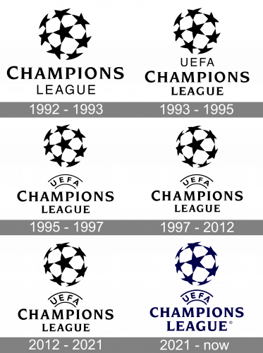
The UEFA logo is definitely one of the most recognizable sports-relatives visual identities in world history. Once designed in 1992, its emblem was only slightly redrawn throughout the years, but it didn’t affect the remarkability and uniqueness. All the redesigns were minor and sometimes they went unnoticed.
1992 — 1993
The very first UEFA Champions League logo was introduced in 1992 and was composed of a rounded emblem with a wordmark under it. The emblem depicted a stylized football with numerous black five-pointed stars as a pattern. It was I framed and looked truly memorable, as a globe made of stars, despite its flat 2D executions
The wordmark in all capitals was set in two levels, with the “Champions” part in a sleek bold serif typeface and with the “C” enlarged, and “League” in a lightweight sans-serif, which added professionalism and stability.
1993 — 1995
In 1993 the “UEFA” lettering was added to the wordmark. It was put under the emblem, and above the “Champions League”, and executed in a modest sans-serif, while the main part of the wordmark featured a bold serif typeface.
1995 — 1997
The redesign of 1995 put the “UEFA” lettering between two arched lines. The typeface was switched to bolder ones but it stayed in sans-serif, balancing an elegant and chic main inscription.
1997 — 2012
The starball was slightly redrawn, making the contours of the pattern cleaner and stronger. The “UEFA” lettering gained more space inside and started looking more modern and professional. The composition and main wordmark remain almost untouched.
2012 — 2021
With the redesign of 2012, the UEFA logo became even more stylish. The typeface of the arched inscription was changed to a new custom sans-serif with the open contour of the letter “A” and slightly rounded angles, while the serifs of the main lettering are now longer and sharper. As for the ball itself, it has its lines refined and cleaned, and now it looks more edgy and elegant.
2021 — Today
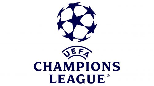
The 2021 version was the same logo, but colored in dark blue.


