TXT is the name of a very popular k-pop boys band, which full name is Tomorrow X Together. The band, formed by five singers, became popular in 2019, after the release of their first single, “The Dream Chapter: Star”. Today TXT has a huge fan audience from all over the world and has a portfolio consisting of already three albums.
Meaning and history
The popular Korean boyz band consists of five members, the oldest of whom was born in 1999. There is no clear division of positions in the band, as each member is good at vocals, rapping, and dancing, and, of course, each also considers himself the prettiest. Well, this is confirmed by millions of female fans of the young k-pop band.
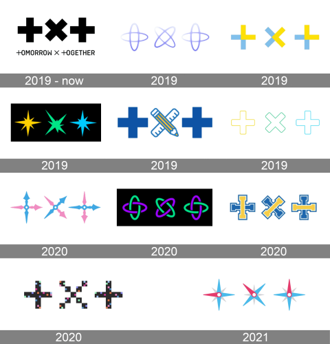
The full name of the band is Tomorrow X Together, but the whole world knows it as TXT, and on each of almost a dozen of the logos, there has only been the shortened name stylization.
2019 – Today
The first badge was created for the k-pop band in 2019 and is still used as the primary official one. It also started the “three X” concept, on which every badge for every new release is built. And yes, it is the only logo version, underlined with the complete name of the band. The logo is composed of two lines — the bold enlarged top line with the “TXT” name stylized as two bold plus sights (for both letters “T”) and a cross of the “X”. All in the same size. The abbreviation is placed above the uppercase “Tomorrow X Together”, where both letters “T” are also replaced by the plus signs. The inscription is set in a modern sans-serif typeface, in plain black.
2019
For the first few months before the release of their debut album, Tomorrow C Together has been using one more logo. A lightweight gradient purple badge with only three elements, for three letters of the “TXT” badge. Each of the crosses was formed by two ellipsoid orbits, which looked futuristic and very tender at the same time. No additional lettering was added to the stylized abbreviation.
2019
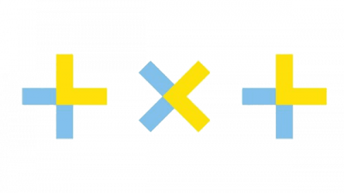
For the release of “The Dream Chapter: Star” the logo of the band was redesigned. It was still the same concept, but different color palette and geometry. Now each element was composed of thin rectangles with straight cuts and angles. As for the color palette, it was about the combination of sky-blue and yellow, and in the primary version the colorful crosses were set on a plain white background, while on the alternative one the crosses were white and yellow, and the background — sky-blue.
2019
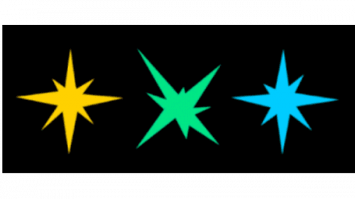
The three sharp eight-pointed stars replaced the TXT crosses with another redesign of 2019, held for the release of “The Dream Chapter: Magic”. The stars featured yellow, green, and blue colors and were placed on a plain black background, standing for the night sky. The bright abstract logo looked good on the album covers and posters.
2019
For the “MOA Membership” another version of the logo was designed in 2019. It was a simple and slightly naive image with both letters “T” drawn as bold plus signs, and the “X” replaced by the image of crossed pencil and ruler, drawn in blue contours, with pencil having yellow vertical stripes over its body. There was also a reversed color version with three white elements set on a solid blue background.
2019
One more logo was used by the band in 2019, and it was a light and cool neon version, with the outlines, crosses in yellow, green, and blue set on a white background. Simple shapes softened angles and bright colors are what made the logo full of energy and motion, evoking a young spirit of the band and its musical style.
2020
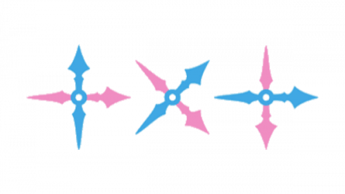
For the release of the “Magic Hour” single, another logo was designed in 2020. It was a blue and pink version, with all three elements replaced by the compass arrows. On each of the letters, one arrow was set in calm solid blue, while the other was medium-pink. Sharp and elegant shapes here were balanced by bright color contrast.
2020
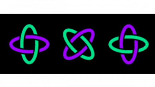
The orbits style was brought back for the “The Dream Chapter: Eternity” album. But on this version, the orbits were in two colors, neon green and purple, and were set on a black background. Another difference was in the thickness of the lines and the more rounded shapes of the elements.
2020
For the “Drama” single, also released in 2020, the logo was stylized as a college sports team badge, with three crossed in blue and yellow, composed of thick straight lines with square serifs on their ends. It was a minimalist yet memorable design, which benefited from the bright color palette.
2020
For the next single of 2020, “Minisode 1: Blue Hour” the logo was stylized as pixel elements and drawn in black with numerous small squares in solid colors from pink and purple to green and blue. The whole design reminded of the Minecraft game, though still became recognized as one of the k-pop boys’ band insignias.
2021
The geographic theme came back to the TXT logo in 2021, with compass arrows straightened up and modernized, but the blue and pink color palette kept unchanged. Here was already more resemblance to the Safari logo, with the blue and pink arrows overlapping light gray ones in smaller sizes. This emblem was created for the “Still Dreaming” album.


