One of the most popular US rock bands, Linkin Park is known for producing music that is quite appropriate for radio in spite of its nu metal and rap metal style. Despite this compromise, their music definitely has a densely layered quality.
Meaning and history
Linkin Park is one of the bands that had numerous logo redesigns throughout their history, but all of the versions were executed in a strict and minimalist style, which became the band’s signifier and made their logos instantly recognizable across the globe.
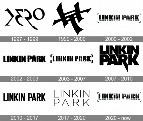
1997 – 1999
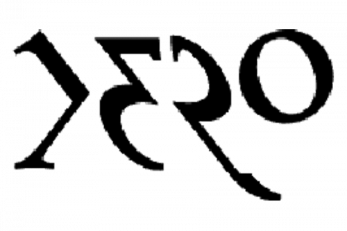
The very first logo refers to the band’s original name, Xero. It showed that name in a font styled like Ancient Greek letters with some curious features: halves of ‘X’ and ‘R’ letters were cut off, the ‘E’ character looked like a mirrored number 3, and the ‘O’ just floated above.
1999 – 2000

For a short time when the band was known as Hybrid Theory, their emblem consisted of several strokes, styled as a Japanese glyph.
2000 – 2002
The very first logo for Linkin Park was executed in a gradient black and white color palette, where its wordmark in bold sans-serif typeface was enclosed in four square brackets. Both letters “N” in the logotype were mirrored, which made the whole logo unique, along with the color of the symbol bodies, which looked like the black ink was partially erased.
2002 – 2003
The redesign of 2002 made the lettering a bit smaller and more delicate and elevated its color palette to a brighter and darker one, leaving a slight light stripe crossing the bottom part of the inscription. The brackets on this version became more visible and distinctive, having just a small white space dividing them into Teo parts.
2003 – 2007
The contours of the logo were refined again in 2003, but this was not the main change. The letters “N” were written in their traditional way. And from now on the band only uses this style of writing. The shapes of the symbols have been enlarged, and the brackets were redrawn, with their bars slightly diagonal.
2007 – 2010
In 2007 the band starts using a completely different logo, where the inscription is set in two levels and composed of extra-bold sans-serif letters, placed very close to each other. The lines of the “A” and “R” are elongated and sharpened, which reflects the character of Linkin Park and its music.
2010 – 2017
The redesign of 2010 was all about a minimalistic and laconic approach to design. The narrowed sans-serif inscriptions with neat capitalized letters were written in black and placed on a white background without any framing or additional details. It was simple, yet elegant, and very confident.
2017 – 2020
Linkin Park changed its logo again in 2017, making it airy and fresh. The black inscription with a lot of space and air in it is now written in a lightweight sans-serif typeface with very thin and clean lines. It is something new for the band, and shows it from a completely different side, intriguing and attracting people.
2020 – Today
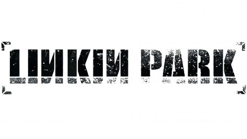
In the 2020, the group returned to its 2000 logotype with few changes.
The 2006 Symbol
In 2006, along with the release of Minutes to Midnight album, a completely new Linkin Park logo was unveiled. The logo featured an “LP” insignia where both the characters were written using only one line. In fact, the letters were hardly legible and looked more like an emblem, but that only added to the symbol’s visual appeal.
The 2017 Symbol
One More Light Emblem
The very essence of the symbol, the intricate “LP” design, has stayed the same, but the round shape around it has been replaced by a hexagon. Every angle of the hexagon is supposed to symbolize one of the band members (six altogether).
Font
In addition to the emblem itself, Linkin Park has a wordmark. It has been modified several times throughout the band’s history. The customized fonts used for their first album, Hybrid Theory (2000), as well as for their remix album, Reanimation (2002), somewhat resembled each other (although the type itself wasn’t the same) due to the “reversed” “N”. In 2003 a common “N” replaced the reversed one.
In 2007, the band had its wordmark heavily modified. Probably, the most recognizable elements of the new insignia were sharp angles in the “N”, “A”, and “R” characters. The new insignia introduced in 2010 featured a minimalistic sans-serif font. In the 2017 wordmark the name of the band is given in a lighter, more transparent color and type, and there’s obviously more space between the characters. It looks only natural, taking into consideration the name of the 2017 album, One More Light.
Color
The contrast between black and white in the Linkin Park logo somewhat reflects the violent emotions their music conjures up. Also, black color, when used in music culture, is often supposed to reflect a connection with underground.


