The athletic logo of Troy University in Troy, Alabama, is unique and recognizable. At the same time, it looks pretty simple.
Meaning and history
The Troy Trojans’ story began with the founding of their athletic program by Troy University, located in the heart of Troy, Alabama. This journey, marked by a series of remarkable milestones, has solidified the Trojans as a noteworthy name in collegiate sports within the NCAA Division I Sun Belt Conference. The program’s history is a tapestry of hard-fought victories, spirited competition, and a commitment to athletic excellence that resonates across various sports disciplines.
In the realm of achievements, the Troy Trojans’ football team stands out as a beacon of success. Their journey through numerous conference championships and prestigious bowl games has not only showcased their skill and determination but also brought national attention to the university. Beyond the gridiron, the basketball and baseball teams have contributed their chapters of triumph, navigating through NCAA tournaments and seizing regional titles, further amplifying the Trojans’ legacy in collegiate sports.
Today, the Troy Trojans maintain their esteemed position in the world of college athletics. Their ongoing participation in high-caliber competitions and their unwavering commitment to nurturing athletic talent continue to reflect the university’s dedication to excellence. The Trojans, as a symbol of Troy University’s sportsmanship and competitive spirit, remain a source of pride and inspiration, embodying the university’s ethos in every game and tournament.
What is Troy Trojans?
Troy Trojans are the name of the college athletic program of the Troy University of Alabama. The program consists of 15 teams in various sports disciplines, both men’s and women’s, and is best known for its men’s football club.
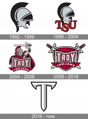
1992 – 1999
The first logo by Trojans was an image of a knight helmet. It had a black comb and a black-and-white visor. The rest part of the helmet was just gray.
1999 – 2004
The Troy Trojans logo, designed in 19993, featured a simple yet powerful image of the gray and black metal helmet with some black details on its top parts, resembling Trojan legends. The image was accompanied by a bold “TSU” abbreviation written in dark burgundy under it. The letters were placed arched — with the middle “S” a bit lower than two others. The bold geometric serif inscription had its burgundy character outlined in black.
2004 – 2007

The redesign of 2004 made the Troy Trojans logo more ornate and complicated. It was a detailed image of the Trojan warrior in gray and burgundy. The warrior was wearing a weaving coat in red, which was accompanied by a gray and red banner with the wordmark on it. The banner was set in gray, with the massive light lettering in bold sans-serif, outlined in dark red. The “Trojans” part was written in white and arched on a burgundy ribbon under the gray stone badge.
2008 – 2016
The current Troy Trojans logo looks more refined than its predecessor. You can see the letter “T” stylized as a sword. In this way, the designer managed to unite the sword, a symbol of the warrior, and the initial of the name of the teams.
2016 – Today
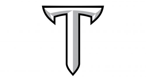
The 2016 Trojans logo is a letter ‘T’, colored in white and gray and styled as an iron sword without a hilt. The letter itself has a black outline.
Troy Trojans Colors
RED
PANTONE: 492 C
HEX COLOR: #8A2432;
RGB: (138, 36, 50)
CMYK: (30, 95, 75, 30)
GREY
PANTONE: COOL GRAY 4 C
HEX COLOR: #B3B5B8;
RGB: (179, 181, 184)
CMYK: (30, 23, 22, 0)
WHITE
PANTONE: P 1-1 C
HEX COLOR: #FFFFFF;
RGB: (255, 255, 255)
CMYK: (0, 0, 0, 0)


