Transavia is the name of the KLM sub-brand, which was established in 1965. Today the Dutch air carrier has its bases in three international airports — Amsterdam, Rotterdam, and Eindhoven — along with a French subsidiary. The airline has its flight available to almost 90 destinations all over the globe.
Meaning and history
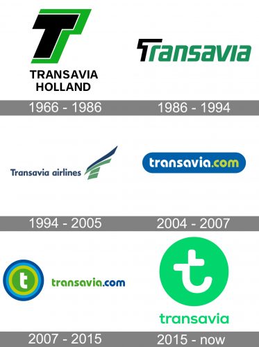
Transavia is one of the not many airlines which have a very intense and bright visual identity history. Throughout more than the first years of the company’s existence, it has changed or refined its logo six times, which is more than once a decade. Though there has always been one main thing in the Transavia logo — green color, a symbol of success, growth, and prosperity.
1966 – 1986
The very first Transavia logo was designed in 1966 and stayed with the air carrier for twenty years, which is quite long. The logo was composed of a bold italicized letter “T” in black and green as an emblem, and a strict and clean “Transavia Holland” wordmark in the uppercase, placed under the emblem and written in black. The letters in the inscription were executed in a modern sans-serif and had a lot of space between each other, which balanced the massive and intense emblem.
1986 – 1994
The redesign of 1986 completely changed the logo of the Dutch airline and darkened its color palette. The new concept included a slanted modern sans-serif inscription with all the letters in the lowercase and the first capital “T” replaced by a graphical icon. The letter was drawn in straight black lines, contouring the right part of the traditional “T”. It was a pretty progressive and energetic emblem, which looked good on light backgrounds and planes of the company.
1994 – 2005
In 1994 the company changes its logo again. Now it is composed of a delicate blue wordmark placed on the left from the new emblem. The emblem features four horizontal and diagonal lines in green and blue, forming an abstract wing. It was a very elegant and stylish logo, which also looked friendly and welcoming due to the use of the smooth typeface and lowercase letters (all but the first).
2004 – 2007
Another visual identity experiment was held by Transavia in 2004. The logo created in that year was the most short-living among all the versions. It was a horizontal blue badge with rounded edges and a lowercase inscription, there the “Transavia” part was drawn in white, and “.com” in lime green. The badge looked fresh and young, showing the potential audience of the brand and its modern and progressive approach to business.
2007 – 2015
The logo was redesigned again in 2007. It was based on the wordmark from the previous version, but the colors were switched — the lettering was now executed in blue and green and placed on a white background, on the right from the newly-designed emblem of the company. The emblem featured a solid lime-green circle in a blue outline and with a lowercase blue “T” in the middle.
2015 – Today
The redesign of 2015 brought a new color palette and fresh air to the Transavia visual identity. The company decided to keep its green circle with the lowercase “T” on it, but now it is a light green and white combo, with the letter executed in a fancy custom rounded typeface: as for the logotype, it is drawn in the same shade of green, and written in the lowercase of a stylish and modern sans-serif typeface with full-shaped contours of the letters.


