Trabzonspor is the name of one of the most famous Turkish football clubs which was established in 1967. The club, nicknamed “Black Sea Storm” (which is “Karadeniz Firtinasi” in Turkish) is managed by Ahmet Agaoglu and has Eddie Newton as the head coach.
Meaning and history
Old

Though Trabzonspor is a pretty old football club, it’s visual identity history can not be called intense or surprising. The logo, used by the team today, was created in the very beginning of its existence, and only slightly modified throughout the years.
The very first badge’s for the Turkish FC were composed of oval medallions in white or burgundy, with stylized letters “T” and “S”, drawn usually in blue or burgundy, or both.
The letters were bold and smooth, with their tails and lines curved, looking like two rivers. Then the two letters monogram turned into a one flowing symbol, drawn in blue and placed on a burgundy background.
The initials also had the club’s foundation date printed in burgundy and centered at the very bottom. In addition, a small blue ball was placed at the very top of the badge. It was a symbol that made it clear that this logo belongs to a sports club.
Old

The new logo looked very similar to the previous one and got only a few modifications. First of all, the background color was much darker and closer to brown than red. In addition, the ball and the date, which was now smaller, were both white. Finally, there was a yellow star above the badge. This element can be seen in the following logos as well and is surely meant to show that this team is the true star when it comes to football.
Old

The club never ceased to modernize and improve its visual identity. It added a golden outline around the badge, which made the star look not so lonely and as part of the logo. The background was a slightly different shade again and looked lighter. Another update was the addition of a shadow behind the monogram.
Today

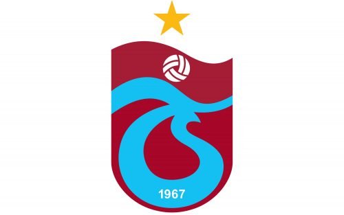
The Trabzonspor logo we all know today features a burgundy shield with a white top, separated by a curvy line. The yellow star is the only element, placed on the white part of the logo.
The main body of the shield contains the iconic blue “TS” symbol, featuring the white “1967” inscription in the bottom. Above the sign, there is a stylized white football with burgundy elements placed as a celebration of sports.
The Trabzonspor logo is unique and instantly recognizable not only due to the use of a very sophisticated football color palette but also because of its smooth floating lines and contours. It is an example of timeless elegance, which will always be actual and will always make the team stand out.
The blue “river” letters of the logo represent the stability and reliability of the club, while the white “sky” stands for loyalty and transparency. Burgundy adds a touch of luxury, and yellow gold evokes a sense of energy and power. A perfect combination.


