Toyota Motor Corporation is one of the largest, most famous, and influential Japanese automobile companies, without which it is impossible to imagine the world automobile industry. The company’s cars are renowned for their quality, endurance, and versatile design. And the iconic logo is one of the most elegant and intriguing car badges in automotive history. The Toyota logo is well-known far beyond Japan. Its exceptional conciseness (in fact, the logo consists of three ovals) contributes to the appearance of dozens of explanations of symbolic and semantic content.
Meaning and history
Not many people know, that one of the most famous Japanese automakers was established in 1933 as Toyoda, the company, specialized in the production of textiles and loom. However, the history of the today-legendary corporation can be traced back to the middle of the 1920s, when Sakichi Toyoda invented the first automatic loom. In 1929 Toyoda decided to sell the rights of his invention to the British Platt Brothers & Co. and used the proceeds to start his own company.
Unfortunately, Sakichi was already dying, so he bequeathed his capital to his son, Kiichiro. And along with the capital, he also bequeathed his dream of creating a car manufacturing company. That would not be the Japanese story if Kiichiro didn’t follow his father’s will. So he decided to travel across Europe and America, learning from the biggest automakers of the day. Returning to his homeland, Kiichiro Toyota began to develop a car with a gasoline engine, which went on sale already in 1935.
Toyoda Motors separated into an independent business in 1937. This year is considered to be the beginning of the history of Toyota. Although officially the name, familiar to us today, was adopted only in 1941. And all because of a simple superstition. The thing is that the word “Toyota”, unlike “Toyoda”, in Japanese is written with eight lines, and “8” is a symbol of success for the Japanese.
In the late 1980s, Kiichiro Toyoda decided that it was time to bring the company to the international market, however, immediately there was a need for a new logo, with which Toyota could immediately declare itself as a serious player in the global market of automakers. A contest was held in which more than 20,000 people participated. The winner proposed a variant of katakana letters, one of the forms of graphic design of characters in the alphabet. And it was this concept that the company’s management liked so much that it is still used by the Japanese automaker today, becoming one of the most iconic logos in the history of auto marketing.
In terms of visual identity, Toyota pays a lot of attention to symbolism and hidden meanings, and it all can be seen in their current logo, created in the 1980s. This elegant and smooth emblem has several interpretations, including the hearts of the company and its customers; the whole world around the brand; and, of course, stylized letters of the company’s name. Before the creation of the iconic oval logo, Toyota has undergone four redesigns, trying to find a perfect graphical representation of its core values and character.
What is Toyota?
Toyota is one of Japan’s largest and most famous automobile companies, which was established in the 1930s. until 1935, the company produced weaving machines of various degrees of automation. It was not until 1933 that Kiichiro Toyoda insisted on opening an automotive department.
1935
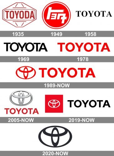
The very first logo for Toyoda company was designed in the 1930s and featured a red and white diamond shape with the inscription in the middle. The lettering was executed in a bold and smooth same-serif typeface, which perfectly reflected the power and professionalism of the brand. As for the diamond shape, it is a symbol of excellence and symmetry, two things, which are very important for the company.
The red and white color palette stands for passion, love, and energy. These two colors have become a signature for the brand along with monochrome, which appeared on the Toyota logo only in the 1950s.
1949
In 1949 the Japanese version was created. For the first ten years it was the only official logo, but in 1958 the new one, international version, was designed. Yet the Asian edition was used by the company until 1989.
It was a bold red circle with a white outline and white hieroglyphs, standing for “Toyota”. Simple, delicate, yet very traditional and modern at the same time. The red circle is a symbol, associated with Japan like nothing else.
1958
The first logotype for the American market was designed in 1958. It was a simple and strict black-on-white inscription in all capitals. The lettering was executed in a bold serif typeface, the one, that is very similar to Times Nee Roman and Nimbus Roman Japanese Bold. With clean yet elegant lines, perfectly characterizing the brand.
1969
The style of the wordmark was changed to sans-serif in 1969. The name of the company was written in black using the custom typeface, similar to Hypersans Heavy, but slightly narrowed.
By simplifying the lines of the logo, the brand made itself look more modern and progressive.
1978
The color palette was switched back to red and white in 1978. The logotype, that is still in use today, features bolder and more balanced lines than the previous version. Tails and bars of the letters are slightly shortened and look more confident. The new inscription is executed in a sans-serif typeface, which is close to Sole Sans Extended Semi Bold.
Though red is the main corporate color for Toyota, today the logotype can be seen in monochrome and gray palette, along with the traditional red-on-white.
1989
The iconic oval emblem was designed in 1989 and hasn’t been changed since then. The Toyota insignia is composed of one main horizontally placed oval, which has two overlapping ovals of a smaller size inside.
As already mentioned, the ovals have several meanings, but the most interesting one is that they form every letter of the company’s name, though the most obvious ones are “T” and “O”.
It is a perfect representation of one of the most influential automobile brands in the world, which is elegant, timeless, and futuristic at the same time.
2005
With the redesign of 2005, the red graphical emblem moves above the lettering and become three-dimensional, changing its color to gradient silver. The badge also gets enlarged and the contours of the emblem — are emboldened, while the inscription parts remain almost untouched, only the shade of red becomes darker and deeper. This is, probably, the most famous Toyota logo ever created, as the emblem on the bonnet of the famous Japanese cars looks exactly the same.
2019

The redesign of the Toyota visual identity, held in 2019, refined the contours of the iconic emblem and drew it in white on a solid red square, placed above the modern black sans-serif logotype. The typeface of the wordmark from the new version repeats the previous one, but due to the use of the new color, it looks more stylish and confident.
2020 – Today
In 2020 the Japanese brand decided to simplify its visual identity and completely removed the text part, keeping the iconic symbol as the only logo element. Its contours were refined, though it didn’t affect the shape and line thickness of the badge. The new official color palette of the Toyota logo is monochrome, and the symbol can be seen in white when placed on intense backgrounds, or in black.
Symbol
The symbolism of the Toyota logo for clients from the East is different than for the clients from the West. So, for Japanese and residents of neighboring countries with Japan, the smaller oval is meant to symbolize the client’s heart, the second is the heart of the Toyota car, and the biggest are the limitless possibilities offered by the brand for both hearts. By the way, mutual intersections of lines also have their significance, symbolizing strong and mutually beneficial relations between the enterprise and the client.
Emblem
The emblem of Toyota experienced a number of transformations through history, during which it acquired volume and slightly changed in size. However, major changes were avoided (exceptions were the color changes that led the logo to the current monochromy). Of course, we are talking about the current logo (the very first company logo was a hieroglyphic sign, too complicated and absolutely meaningless for the Western consumer). But the new, selected from more than 46 thousand options (the company in 1936 announced a contest for the best logo), is equally well read by both Western and Eastern consumers. For the Western – it easily reads the capital letter “T”, for the eastern – the philosophy of the logo and the entire brand is complex enough to cause respect.
2d emblem
The two-dimensional emblem of Toyota repeats the iconic stylized badge composed of several ellipsoids, forming the letter “T” enclosed into a horizontally oriented frame. The execution of the emblem is exactly the same as on the primary logo, introduced in 2020 — in a black-and-white color palette, with plain flat lines, but due to the clean and strict contours, it looks powerful and very modern.
Font
The Toyota font was developed taking into account, first of all, access to the international market. Proceeding from these plans (more than ambitious for the Japanese enterprise of the first third of the twentieth century), the font had to correspond to the restraint of the expectations of Western civilization, and at the same time to be perceived as sufficiently reliable and authoritative.
Color
The current color of the logo is silver metallic. However, it was not always so. So, in different periods of its history the logo was used even in the corporate red color of Toyota. And all because the changes, as they say in the company itself, are necessary to maintain interest in the brand, but the logo is good enough to change it substantially. In addition, the current logo is a kind of person of the company, a mirror of its unblemished reputation, and to preserve this mirror in this form is of interest of both the manufacturer and his customers.
What is the hidden meaning of the Toyota logo?
The company still does not disclose the exact meaning of this particular emblem. For this reason, there are many interpretations today. But the first and most common one is a stylized image of a thread being threaded into a needle, as a representation of the company’s roots.
What does the Toyota symbol mean?
One of the versions of the Toyota logo meaning is the idea of progressive development, depicted by three ellipses in different sizes, with the small one standing for the heart of the client, the horizontal one as the heart of the product, and the outer one the mission of the company, which is a developing of technologies and innovations approach.
Why is the Toyota logo the way it is?
Initially, the brand name was used as the logo, but with its growing popularity, an emblem was needed that could be mounted on the hood of the car, and customers would immediately recognize the brand by this figurine. The second main criterion for the logo was its internationality.
What letters are hidden in the Toyota logo?
According to one of the versions, the abstract symbol from the Toyota visual identity is composed of all the letters of the company’s name. They are hidden in the three ellipsoidal elements of the emblem, featuring smooth arched contours.


