Italian football club Torino was founded in Turin, Piedmont, in 1906. Initially, it was called Foot-Ball Club Torino. Today, it’s one of the country’s most successful clubs, which can boast seven league titles.
Meaning and history
The meaning of the Torino FC logo is deeply rooted in the symbolism of the club’s home city, Turin. The Italian word for “Turin” is “Torino,” while the city’s emblem features a rampant bull. Hence the club’s nickname “il Toro,” which means “the Bull” in English.
Taking into consideration this fact, it’s hardly a surprise that a rampant bull has been a recurrent motif in the club’s crest throughout all of its history.
1936 — 1946

The Torino FC badge, created in 1936, featured a traditional heraldic composition in dark red and white, with additional elements in gold, black and light blue. It was a straight and strict geometric crest, vertically divided into two equal parts — the dark red on the left, and the white on the right. On the red background, there was a delicate light blue crest with a golden bull drawn on it and a golden crown above it. The right part of the crest contained a thin geometric “TAC” monogram with tall narrowed letters in a stylized serif typeface overlapping each other, executed in burgundy.
1959 — 1977
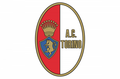
The redesign of 1959 kept the idea and composition of the previous badge, but redrawn all elements and switched the shape of the logo from crest to a vertical oval. The golden frame became thicker, and the contours of all elements were now outlined in thin black. The crown became more massive, as well as the golden bull on the blue (which was now darkened) background of a crest. The monogram was replaced by a full “AC Torino” inscription in all capitals of a bold and narrowed sans-serif tour face, with each of the golden letters outlined in black.
1977 — 19..

In 1977 the Torino logo was redesigned again, with the bull and the crown redrawn using more blue shades and less golden ones. The inscription was now set vertically and executed in a serif typeface with its capital letters written in burgundy. The bold golden frame with clean neat contours was replaced by an elegant and ornate one in dark gold and burgundy. This new framing made the logo look more like an ancient medallion or a brooch.
19.. — 1983

Another version of the logo, created for the Italian football club, featured its traditional two-colored vertical oval enclosed into an interesting triple frame in orange and white with the clean and simple orange line from the inside, a rope-like orange from the outside, and white between them. The long vertical inscription was replaced by two intertwined “TC” letters in a classy and simple serif typeface, in a dark burgundy shade. As for the left part of the badge, it still boasted a crest with a bull and a crown drew on it, but now golden elements were switched to orange, which made them look sharper and more powerful.
1983 — 1990
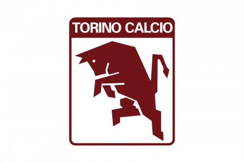 The Torino logo of the 1980s featured the bull with the words “Torino Calcio” (both placed in a square frame)
1990 — 2005

In 1990 the badge from the 1980s comes back to the Torino FC visual identity, but being refined and modernized. The orange rope-like frame was emboldened, and the orange crown was switched to a bright yellow one, redrawn in a new fancy style. The “TC” intertwined monogram was enlarged and started being the element that is equally important for the composition as the bull crest with the crown. As for the small bull crest, it got brighter due to the use of a turquoise and yellow color palette.
2005 — Today
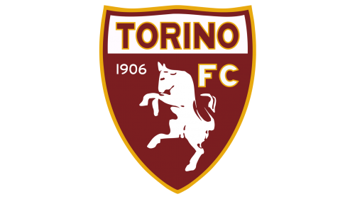
The redesign of 2005 introduced a completely different Torino crest, which still keeps the main elements of all the previous badges. It is a maroon shield in a yellow outline, with the upper part in white, featuring an uppercase “Torino” inscription in a bold modern typeface. The body of the crest had a stylized white image of a bull on it, complemented by the white “1906” datemark on the left, and white in a yellow outline ExtraBold “FC” lettering on the right.
Colors
The logo is dominated by maroon. In maroon, the passion and energy of pure red is somewhat muted, and therefore, looks nobler. Yellow, blue, and white are used as accent colors.
Torino Colores
RED
PANTONE: 7526 C
HEX COLOR: #8A1E03;
RGB: (255, 255, 255)
CMYK: (0, 0, 0, 0)
YELLOW
PANTONE: 7409 C
HEX COLOR: #EEB111;
RGB: (255, 255, 255)
CMYK: (0, 0, 0, 0)
BLUE
PANTONE: 279 XGC
HEX COLOR: #5E91CC;
RGB: (255, 255, 255)
CMYK: (0, 0, 0, 0)
WHITE
PANTONE: P 1-1 C
HEX COLOR: #FFFFFF;
RGB: (255, 255, 255)
CMYK: (0, 0, 0, 0)


