

![]() Saint-Étienne Logo PNG
Saint-Étienne Logo PNG
Saint-Etienne is the name of a French football club, also known under the nickname “Les Verts”, which translates to English as “The Greens”. The club was established in 1933 and today it plays in Ligue 1, being one of the strongest teams, and has Claude Puel as the head coach.
Meaning and history
![]()
The famous French club got its nickname for a reason — their visual identity has always had green as the main color of the palette. Though all the versions of the club’s emblem feature completely different styles and compositions, the green has never left Saint-Etienne’s logo.
1933 — 1940
![]()
The original logo is a green outline of a simple shield. Its insides are mostly white, save for a diagonal writing that says ‘Asse’ in green letters.
1940 — 1960
![]()
The 1940 design introduced a new shape. There are three interlocked circles, arranged at an angle, except the bits of circles located inside one another are cut to make room for the writing. The color of the circles is green with white outlines. The writing, for its part, is the very same, but white and with a bolder, rounder font.
1960 — 1968
![]()
The following design is a plain, square shield with the green background and a trio of vertical white stripes in the center. Closer to the top, there is a horizontal white line where the word ‘Asse’ is located now. The letters are green this time.
1968 — 1978
![]()
In 1968, they introduced a design with a circle at its base. Half of it was green, the other half was white, and there was also a yellow frame around it all. Inside, there was imagery of a black leaping puma, a soccer ball and bits of club’s name. The latter consisted of a white word ‘Asse’ above and a smaller ‘Saint-Etienne’ below.
1978 — 1980
![]()
The emblem designed for the club in 1978 was composed of a bright green square shield in a gold outline. Inside the big shield, there was a smaller one with a vertical stripes pattern in white and green, where each stripe was also outlined in gold.
The “ASSE” lettering, standing for “Association Sportive de Saint-Etienne”, was written in gold on a white horizontal rectangle which was overlapping the shield.
The green, white, and gold color palette of the logo was bright and vivid, it reflected the active and progressive team, willing to move and win.
1980 — 1988
![]()
The 1980 logo is a simpler shield. Its insides are largely colored dark green, except for three vertical stripes of white and a white bit in the top. The latter is where they wrote ‘A.S. Saint-Etienne’ in green.
1988 — 1993
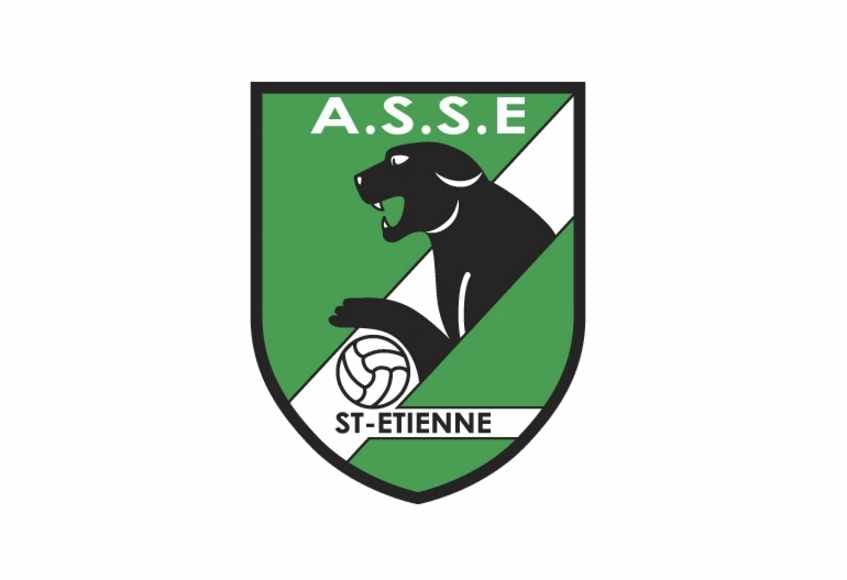
The gold color of the Saint-Etienne palette was replaced by black in 1988. It was a completely new style and concept, where the animal mascot appeared. It was still the shields-shaped badge, but a smooth and narrowed, more elegant one. The green color gained a new darker shade, which looked more professional and strong.
The green shield in a thin black outline featured a wide white diagonal going through it from the bottom left corner to the top right. The black panther was coming out of the white line, watching left, it was holding a white football with thin black lines.
The “A.S.S.E.” Lettering in white was placed in the top of the badge, above the pan-ther’s head, while the “St-Etienne” inscription in black small letters was located under the animal image, on a horizontal white line.
1993 — 2022
![]()
The logo we all know today was designed in 1993, and for today it is the longest-lasting emblem of Saint-Etienne football club. It is a bold green circular badge with a thin Star on top of it. The White Star has a blue, red, and white outline, celebrating the colors of the French national flag.
Inside the bold green emblem, there is a smaller white circle with a vertical stripes pattern in green and white and a horizontal rectangle with “A. S. S. E.” inscription in a thin modest sans-serif typeface.
Around the green perimeter of the emblem, the white “Saint-Etienne Loire” inscription is placed. Executed in the same lightweight sans-serif it adds freshness and balanced the look of the logo.
2022 — Today
![]()
The club brought back the shield shape for its logo. It also preserves the white and green colors along with the three white stripes seen in some of the logos. The “ASSE” acronym was printed in large sans-serif white letters across the top, while the “Saint-Etienne” inscription on the next line was done in a much smaller font. The star from the previous logo was placed at the very top similarly to the previous version. Unlike any of the earlier logos, this one had the foundation date as well as a symbol with a crown and wings.


