TIME is an American iconic magazine, which was founded in 1923 by Henry Luce. TIME magazine covers any and all remarkable news among a vast array of topics. TIME has the world’s largest circulation for a weekly news magazine.
Meaning and history
The visual identity of one of the most reputable magazines in the world has always been traditionally elegant and modest, based on a single logotype, which was only slightly refined throughout the years, the editorial prefers to accent more on its covers, than on the logo, and chooses simplicity and sophistication.
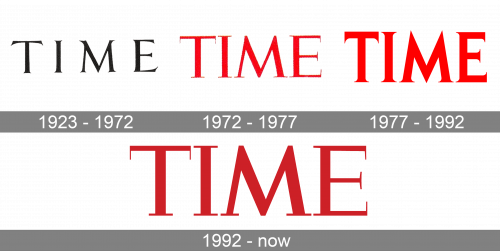
1923 – 1972
The very first logo for Times was introduced in 1923 and featured a classy lightweight logotype in black, executed in a traditional typeface with its letters’ serifs placed slightly diagonally and pointed. The thin elongated serifs made the whole logotype look fancy and tender, though it did still evoke a sense of professionalism and authority.
1972 – 1977
The original logo, which was in use by the magazine for almost fifty years, was redesigned in 1972, changing its monochrome palette to red and thickening its letters’ lines. The new logo looked powerful and bright, reflecting the influence of the brand and its confidence in the information provided.
1977 – 1992
The lines of the logotype were refined and cleaned in 1977; when the typeface was replaced by the new one, with more distinctive shapes. The letters became narrower, but due to the serifs enlarged they looked balanced and its letter “M” resembled the Metro sign.
1992 – Today
The logo was redesigned again in 1992, by switching the serif typeface to a more lightweight one. Though three red versions of the magazine’s visual identity featured different fonts, they all have a strong character and show the brand at its best, being eye-catching and instantly recognizable.
Font and color
The current Time logotype is executed in a custom serif typeface, which has its sleek straight lines complemented by geometric elongated serifs, which make the whole inscription unique and strong. The typeface is close to such fonts as Lost&Foundry FS Century and Marcus Traianus Extra Bold, but with the shapes of the serifs modified.
The red color palette of Time’s visual identity is a representation of power and a good reputation, along with the reliability and trustworthiness of the magazine and its progressive approach.


