TIAA was founded in 1918 as a fully-funded system of pensions for professors. Its founders were Andrew Carnegie and Henry S. Pritchett, the head of the Carnegie Foundation for the Advancement of Teaching. Over time, the organization entered the Fortune 100 list. As of 2021, it is ranked No 79 on the Fortune 500 list.
Meaning and history
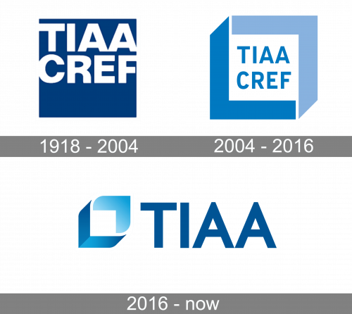
For much of its recent history, the TIAA logo has remained loyal to its bluish palette and a clean sans serif typeface. Even when the design went through a complete overhaul, these features were preserved.
1918 – 2004 (TIAA-CREF)
The very first TIAA-CREF logo was created in 1918 and stayed unchanged for almost a century. It was a solid blue square, with a deep and calm shade of blue, which symbolized professionalism and stability. The square featured a massive two leveled inscription in white, written in its upper part, with the heavy capital characters set in a strong geometric sans-serif font. The color of the lettering stood for loyalty and stability, and together with a blue background, it created a very serious and reliable look.
2004 – 2016 (TIAA-CREF)
If you look at the old logo, you will immediately perceive its similarity to the current one. It works on several levels, from the palette and typography to the emblem.
The old logo is placed in an unusual frame combining two shades of blue, a lighter and a darker one. The frame is broken down into two identical angular shapes. Together, they look like a link in a chain. The darker blue part is like the outer surface of the link, whereas the lighter part represents the inner side of the link.
Over the white background inside, you can see the old name of the organization, TIAA-CREF. Each of the two acronyms is placed on a separate line. Both are given in the same color, features letters of the same size and typeface. This uniformity is remarkable – it is a clear indication of the fact that both the words carry the same weight in terms of meaning.
We can compare it with many other logotypes, where one word is more important: it would be set in larger, more eye-catching glyphs. By contrast, the second word would be smaller because it serves explanatory purposes (note, for instance, the logos of the TJX Companies or HCA Healthcare).
2016 – present (TIAA)
The link theme is still present in the newer TIAA logo. However, here, the link doesn’t serve as a frame for the design but becomes a more independent element. It is placed to the left of the wordmark.
The shape looks more refined and professional. The designers who updated the emblem rounded the top left-hand corner and the lower right-hand corner. As a result, there is more dynamism here. This helps to capture the viewers’ attention, thus making the design more effective.
What is TIAA
TIAA (the Teachers Insurance and Annuity Association of America-College Retirement Equities Fund) has been known as a major provider of financial services for employees working in such spheres as teaching, research, medicine, and government, to name just a few.
The wordmark has been shortened to reflect the new name of the brand. As a result, the logo has grown easier to grasp at a single glance as the glyphs are by far larger than they used to be.
The type has been slightly updated. You can notice it in the shape of the top parts of the “A’s.” The white triangles have grown smaller, while the angles on the tops of the glyphs have grown sharper. That said, the overall style has remained unchanged.
Colors and font
A calm blue palette has been used in both the old logo and the 2016 version. The mood and associations created by these colors perfectly fit the company.
Having said that, we need to acknowledge that the colors have grown more vivid and saturated in the 2016 TIAA logo. For one, the name of the brand is by far darker creating a better contrast with the background. This results in enhanced legibility. Also, the designer added a gradient to the link emblem creating more depth.
In spite of the fact that the typeface went through subtle alterations, it has preserved its minimalist style. This is another factor contributing to the perfect legibility of the wordmark.


