The official name of Three UK is Hutchison 3G UK Limited. It is a telecommunications and internet service provider headquartered in Reading, England, the UK. Its parent company is CK Hutchison Holdings, which has mobile operations in eleven countries.
Meaning and history
The Three logo seems to have been growing calmer overthe years. Nevertheless, it has preserved some of its original wild style. Despite its seeming simplicity, it perfectly fits the company it belongs to.
What is Three UK
Three is known as one of the four largest mobile network operators in the United Kingdom boasting over 9,3 million active customers (as of the fall of 2021).It offers 3G, 4G, and 5G (in specific areas) services using its own network infrastructure. 5G was introduced in August 2019
2003 (concept)
Three UK officially started working on 3 March 2003 as the country’s first commercial 3G-only network.
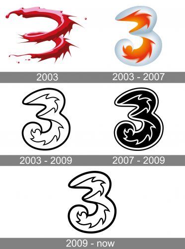
Before the company was launched, it had a prototype logo. It featured the figure “3” formed by a spiral. The spiral was made up of liquid red paint. The edges were uneven, with sharp nuances and occasional drops here and there.
2003 – 2007
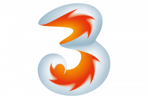
The thick red liquid was replaced by orange flames. The flames are placed inside a larger gray “3”, which looks perfectly normal, with even edges. As a result, it is easier to read the figure in this version than in the previous one.
So, although the conceptThree logo looked more creative and emotional, the company later adopted a version that was easier to grasp.
2003 – 2009 (secondary)
At the same time as the primary logo was adopted, the company also developed a secondary version. It was more basic, easier to reproduce. That was because the gray and orange gradient was gone. Instead, there was only the outline of the letter and the “flame” inside it.
2007 – 2009
The flat version attained the status of the primary logo. Here, the filling of the “3” was black, while the outlines were mostly white. Only the outer border was black. The flat version of the Three UK logo gave a chance to experiment with fillings and backgrounds.
2009 – present
The company adopted a logo that looked more like the secondary version from 2003-2009. It was flat, the filling was white, while all the outlines were black. This move made the logo slightly simplerbecause one of its outer borders disappeared.
Colors and font
The combination of black and white is extremely widespread in logo design. This can be viewed as an advantage or a drawback, depending on the type of company the logo belongs to and the shape of the emblem.
On the one hand, such a basic color scheme looks very simple. On the other hand, it gives the brand unlimited possibilities – they can place the Three UK logo in any visual context. Then, they can vary thecolor of the“3”and the “flame” depending on the colors that surround it. This gives the brand the possibility to experiment with its visual identity, even though the most often used version is just black and white.
The corporate type is Helvetica Neue, although it is not the one that is featured in the Three UK logo.


