The Thrasher magazine is sometimes referred to as skate culture Bible. Today, if you wear items with the Thrasher logo, it doesn’t necessarily show you’re a skater, but at least that you appreciate and support the subculture.
Meaning and history
The first issue of the magazine was published in San Francisco in early 1981. The font Banco that was used on the cover was associated with Caribbean lifestyle and reggae after it appeared on the cover of one of Bob Marley’s album. These concepts were close to the magazine’s co-founders and to the spirit of the publication, which was probably the reason why the font had been chosen.
In the course of time, the magazine established itself in the West Coast skate culture. As a result, the “reggae” roots of the type were forgotten and it became the main font of the country’s skate culture.
Symbol
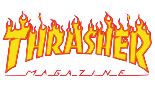
The logo is based on the wordmark. It features the word “Thrasher” in a bold, slightly slanted font. There’re stylized flames of fire above the upper parts of the letters. Under the wordmark, there’s the word “Magazine” in capital letters of smaller size.
Emblem versions
The emblem exists in more than one variation. Apart from the “burning” emblem, which is often seen on the brand’s merch, there’s a calmer version without any signs of “fire,” which is typically used for the website and on the magazine cover. It can be given in several colors, for instance, black, white, and red.
Font
The name of the type is Banco. It was created by graphic artist Roger Excoffon from France in 1951. In fact, during the first couple of decades of its existence, the type was considered a bit generic and inexpensive, so it was primarily used in “unfashionable” places, like butcher shops or bookstores until Bob Marley used it.
Colors
The regular version of the Thrasher logo features a “fiery” combination of yellow, orange, black, and red. As the wordmark is often placed on clothes, other versions are also possible (neon green and blue, for instance).


