Flash is the name of a comics-based tv series, which had its first episode released in 2014. The super-popular American series for today has gained a huge audience from all over the world, enjoying the story of Barry Allen throughout long seven seasons.
Meaning and history
The action of this comic series takes place in the same universe as the heroes of Arrow. Barry Allen, as a child, saw some supernatural force kill his mother. The boy’s father was accused of the crime and imprisoned. Since then, it has literally become Barry’s mania to find that real mystery killer.
A classic superhero plot of the series is what made it popular among people of different ages. Barry was raised by cop Joe West. After graduating he becomes an assistant medical examiner in Central City and his work. His various work brings him to the S.T.A.R. lab staff and the superhero Arrow. After the explosion in the lab, Barry gets into a coma for nine months, and when he woke up, he discovered he had gained superpowers. He can now move at unimaginable speeds.
Arrow gives him a new name, The Flash. Like any superhero, Flash has his mission in protecting the good from the dark superpowers. But he also tries to investigate his mother’s murder.
2014 – Today
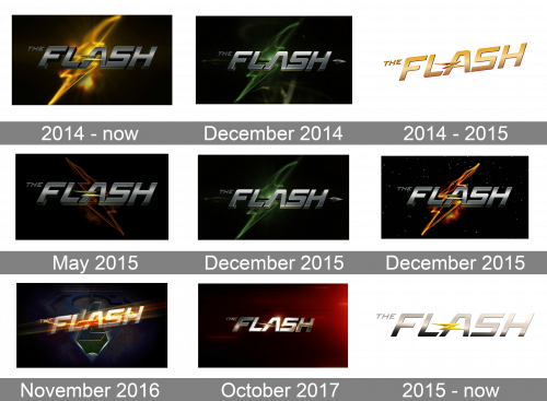
The main logo for Flash was introduced with the release of the first episode, in 2014, and since then was only slightly modified in terms of colors and disposition throughout the years from season to season. The initial concept is built around a three-dimensional silver logotype in the uppercase, executed in a custom stylized sans-serif with horizontally stretched lines and rounded angles of the letters. The logotype is set on a dark background with a yellowish gradient image of lightning. The transparent lines coming from the central element of the badge create a kind of voile for the badge, making it look mysterious.
December 2014
A few months after the release of the series the new version of the logo was introduced — with the lightning and its gradients in a green palette. With the new color combination, the logo changed its mood to a calmer one. As for the inscription, it changed its silver shade to a more even and light one, and the letters got a bit smaller.
May 2015
In May 2015 the logotype got enlarged again and the color of the background was switched to dark orange, with the lighting bolt contours more visible now, and placed in a different direction than on three previous versions of the logo. This version looked stricter and cleaner due to less gradient and blurred elements, although the color of the inscription turned to a darker shade again.
December 2015
The green badge from 2014 came back in December 2015 with no visible changes. The contours of the letters got slightly refined and their size got bigger, but it didn’t affect the image or its mood at all.
Another Flash logo version introduced in December 2015 was different from all the previous ones as had a black starry sky on the background. As for the main elements, the lightning bolt was now executed in fire palette gradients, and the inscription got more contrasting shades of silver and black, getting the letters brighter and more powerful than before.
November 2016
In November 2016 the Superman sign appeared on the background of the Flash logo, with an overlapping stylized letter “L” and the iconic uppercase logotype, which was now placed a bit diagonally, in the upright direction. The wordmark was executed in silver and topped with the electric voile in white-yellow-orange transparent gradients. It was a very intense and bright version.
October 2017
The Flash emblem from 2017 looked more modern and stylish than any previous one. It was a sleek glossy logotype placed on a gradient maroon background, which looked like smooth velvet. There was something truly mysterious in this badge, due to the right choice of colors and minimum of elements on it. No lighting bolt was used for this badge, although the small stylized one was horizontally placed on the right part of the letter “A”.
Promotional
2014 – 2015
For promotional purposes, the franchise had a separate logo. The version from 2014 featured a diagonally located logotype in gold with a three-dimensional Z-shaped lightning bolt embedded in the left part of the letter “A”. The inscription was set on a white background and looked quite bright and fancy.
2015 – Today
The redesign of 2014 placed the inscription in a straight horizontal line and switched the gold color palette to silver, with the lightning bolt in a bright yellow shade of gold. This version looked cleaner and more professional than the previous one, with a modern and stylish mood and confident color scheme.
Font and color
The Flash logotype in all capitals is executed in a custom sans-serif typeface with its bold letters slightly stretched horizontally and their ends with straight cuts elongated. The smooth angles and distinct contours of the letters look very cool and even futuristic.
As the franchise uses a different version of the logo, its color palette changes constantly, but the thing that remains untouched is the silver color of the wordmark. It created a fresh mood and can even evoke a sense of danger, showing the fighting aspects of the series plot.


