The Beach Boys is the name of a rock-band which was established in 1961 in California by the Wilson brothers. The band became famous at the end of the 1960s and by today it has released 29 albums and sold more than 100 million copies.
Meaning and history
The Beach Boys feature one of the most recognizable logos in the world’s music industry. It has never been changed since the day of its introduction at the very beginning of the band’s career, and it perfectly suits any background and texture, staying remarkable and bright.
The iconic logo is composed of smooth cursive lettering with the “Beach Boys” set in one line with each “B” capitalized, and “The” placed above the main inscription, oriented diagonally between the two words.
The customer stylized letters “B” have the contour of their upper parts open and the tails a bit elongated and curved, while the last letter of each word has its tail elongated down and underlining all the previous letters.
1962
The Beach Boys logo, used by the band in 1962, featured a very elegant uppercase inscription in an unusual khaki shade. The lettering was set in a custom sans-serif font with flared ends of the bars, which added playfulness and chic to a pretty simple composition.
March 1963
In 1963 the band was using three different badges, and the first of them boasted a heavy white lettering in the uppercase of a narrowed Extra-bold sans-serif font, written across the sky-blue background.
September 1963
Another logo, used by The Beach Boys in 1963, was designed in September and featured a green italicized capitalized wordmark in a fancy serif font with sharp elongated lines of the characters.
October 1963
The third badge, created for the band in the same year, was a stable purple lettering in a full-shaped modern geometric sans-serif, with a progressive mood and a distinctive sense of confidence.
March 1964
The first badge from 1964 boasted a heavy lowercase lettering in a smooth purple shade, with the stable characters written in a modern sans-serif, and looking very balanced.
Juli 1964
In July the logo of The Beach Boys was changed again, with the lettering switched to the uppercase, the color — to dark red, and the typeface — to a more interesting sans-serif with the slightly arched bars of the letters and straight distinctive cuts of the ends.
October 1964
The redesign of October introduced a new badge of the band — the extra-bold stencil sans-serif inscription in solid yellow color, which looked very progressive and evokes a sense of energy and joy.
November 1964
In November the logotype of the band was rewritten with “The” in small characters in the title case, and the “Beach Boys” in the enlarged capitals, with both parts set in solid orange and executed in a modern sans-serif font with some of the bars’ ends cut diagonally.
March 1965
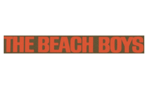
The logo, created for The Beach Boys in March 1965, featured a dark red uppercase lettering in a softened Extra bold sans-serif font, written against a brownish background. The badge looked very powerful and intense.
Juli 1965
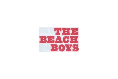
In July the logo of The Beach Boys was redrawn again, with the lettering set in three levels on a light blue background. It was an uppercase red inscription in a heavy geometric serif font with massive square serifs on the ends of the thick bars.
November 1965
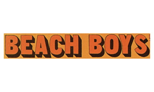
The badge, created for the band in November, 1965, boasted the “Beach Boys” inscription in the uppercase of a modern sans-serif typeface with shadowed letters, looking voluminous and energetic in the orange and black color palette.
1966
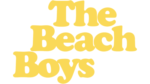
The redesign of 1966 has created a very sunny and dynamic logo with the inscription set in three lines of an extra bold rounded serif typeface with the levels shifted diagonally, making up bright yellow stairs, leading to the sun.
September 1967
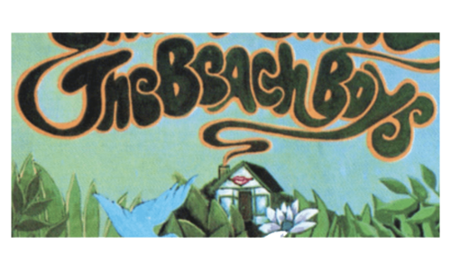
In September 1967 the logo of the band became more ornate, with a stylized hand drawn lettering in smooth heavy lines with rounded contours and elongated tails of the characters, set in dark green color with a soft orange outline, and placed above the fantasy image with a small house, plants and a bird, executed in a green and blue color palette.
December 1967
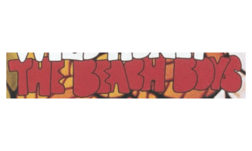
Another badge from 1967 boasted a heavy uppercase lettering in a hand drawn rounded font, set in dark red color with a thin black outline, written against an orange patterned background.
1968
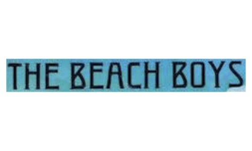
The redesign of 1968 has created a very elegant logo with the black uppercase lettering in a fancy art-deco font with tiny sharp serifs on the ends of the sleek bold bars. The black wordmark was set against a lm intense blue background, creating a beautiful color palette.
1969
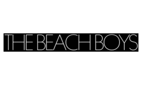
In 1969 the logo of The Beach Boys was set in monochrome, with the lightweight white lettering placed on a black banner. The in script was set in the uppercase of a modern sans-serif font with full-shaped contours of the characters.
1970
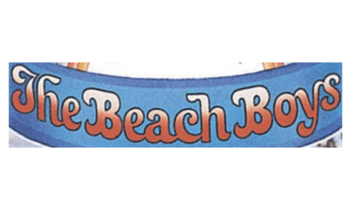
In 1970 the name of the band was written on a blue arched ribbon in a gradient beige to red palette, with the smooth rounded characters outlined in black for a stronger contrast.
1971

The redesign of 1971 has created another art deco style badge for The Beach about. It was a bold black lettering in the uppercase, set against a plain white background, with the capital characters decorated by thin black and white stripes in the emboldened vertical bars.
1973
In 1973 the logotype of the legendary badge got set in two lines, with the bold serif lettering set in two shades — brown for the top line, and light green for the bottom one. The inscription was placed on a plain black background.
1976 – 2021
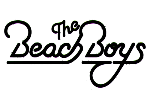
The redesign of 1976 has created The Beach Boys badge, which has stayed with the band till 2021, and became iconic. It was a flat black lettering in a custom script font, looking like a neon banner of the 1970s, with smooth elongated lines and very elegant contours of the letters.
1977
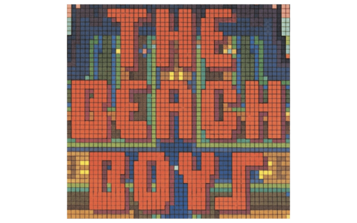
In 1977 the logo of the band was very ornate and colorful. With the pixel pattern of the badge, it was composed of a heavy stylized lettering in dark red, set on a background with blue and yellow accents, reminding of a night City landscape.
1978
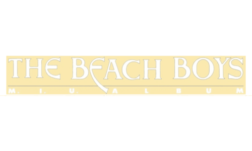
The new badge of The Beach Boys was created in 1978, and boasted a light and airy composition in smooth yellow shade with white characters written on it. The name of the band was written in a custom elegant typeface with some lines of the letters elongated.
1979
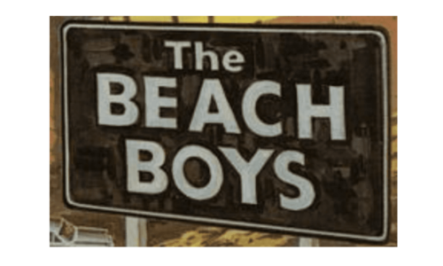
In 1979 the logo of The Beach Boys was drawn like a black road sign with a white three-leveled lettering, where “The” featured a smaller size and was set in the title case, and the “Beach Boys” was written in the uppercase of a simple sans-serif typeface.
1985
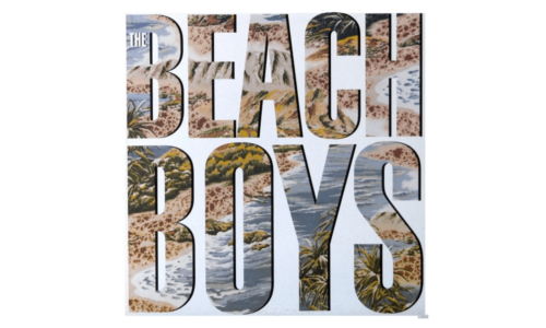
The logo, designed for the popular band in 1985, depicted a voluminous uppercase lettering with the heavy characters executed in a three-dimensional way, having a pattern of a beach landscape with sands, palms and the ocean.
1989
In 1989 one more badge was designed for The Beach Boys. It was a white uppercase inscription in a modern sans-serif font, set against a black and red background of the album cover, with the stable characters set far from each other, creating a stretched white line.
2021 – Today
The tail of the “Boys” “B” is connected to the upper part of the “H”, making the inscription one whole organism and creating a sense of unity and togetherness. And the rounded edges of the smooth letter lines make the wordmark look friendly and soft.
As for the color palette of The Beach Boys logo, the band usually used monochrome, but the inscription can change to any possible color depending on the needs and the background. Among the most famous options — yellow letters in a thin black outline, representing sun, fun, and happiness.
The logotype also looks great in neon shades, resembling huge disco banners and making you remember dancing and laughing.


