One of the most popular restaurant chains in the US, TGI Fridays belongs to TriArtisan Capital, a New York-based private equity firm.
Meaning and history
TGI Fridays, an iconic brand in the American casual dining landscape, was founded by Alan Stillman in 1965 in New York City. This inception marked the beginning of a new era in the restaurant industry, characterized by a unique blend of good food, vibrant ambiance, and a focus on the emerging singles’ scene at the time. The founding of TGI Fridays played a pivotal role in revolutionizing the concept of casual dining, intertwining it with social interaction.
Throughout the years, TGI Fridays has achieved numerous milestones that have significantly shaped its journey. One of its most notable achievements was the introduction of the Happy Hour concept, which became a staple in the industry. This innovation not only attracted a broader customer base but also set a new standard for customer engagement in the casual dining sector. Furthermore, the company has been a frontrunner in menu innovation, consistently introducing new and exciting dishes and drinks that resonate with evolving consumer tastes. Another key highlight in the company’s journey was its international expansion, which began in the late 20th century, making it a global brand with a presence in numerous countries.
In its current position, TGI Fridays continues to be a major player in the casual dining industry. Despite facing challenges such as increased competition and changing consumer preferences, the company has managed to stay relevant through continuous innovation and adaptation. Its focus on digital transformation, customer experience enhancement, and menu diversification has helped it maintain a strong market presence. TGI Fridays’ ability to evolve while staying true to its core values of quality food and lively atmosphere underscores its enduring appeal and resilience in a dynamic industry landscape.
What is TGI Fridays?
TGI Fridays is a renowned American casual dining restaurant chain, known for its distinctive ambiance and a wide array of American cuisine and beverages. With its origins rooted in social dining, it has grown into a global brand, synonymous with a relaxed dining experience and innovative menu offerings.
1965 – 2004
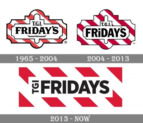
The first TGI Fridays location was opened in 1965 in New York. The original TGI Fridays logo contained by far more details than the current one. To begin with, the type was a pretty elaborate one, with lots of tiny decorative details. There was even a purely decorative element reminding a curly bracket below the word “Friday’s.”
The lettering was housed inside an intricate shape with its border made up of red and white stripes.
Some locations used different logos. For instance, the lettering “Friday’s” with a striped bar below.
2003 – 2013
The design was somewhat simplified. The type was replaced by a more utilitarian (although still playful and casual) sans. The curly bracket disappeared. The red grew darker, while the border of the logo grew wider.
2013 – Today
The emblem was updated by Jane MacDowall and her creative team based in Scotland. The design made one more step towards simplicity and minimalism.
To begin with, the logo now had a clean rectangular shape. In the center, there was the word “Fridays” (it dropped the apostrophe). The type lost the playful style of its predecessor – it was now a generic, rather bold sans. The lettering “TGI” (without the dots, to make it look simpler) was moved to the right of the “Fridays” and was rotated.
You can also come across a wordmark in red without the red-and-white border.


