Jack in the Box is the name of the American dash-food chain, which was established at the beginning of the 1950s, with the first location opened in San Diego, California. By today the company has grown into a huge chain of more than two thousand locations over the United States and is most known for its hamburgers.
Meaning and history
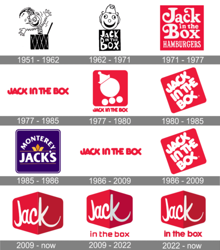
Jack in the Box is very popular in the America chain of fast-food restaurants, specializing in hamburgers and fried chicken. Established in 1951, the chain has a very intense visual identity history, with numerous major and minor redesigns held throughout the years.
1951 – 1962
The very first logo of the restaurant was created in 1951 and stayed in official use for almost a decade. It was a simple and even naive image of a kid’s Jack in the box toy, executed in monochrome and with no lettering added to the composition. It was a very kind and friendly badge, evoking a welcoming feeling and reflecting a warm atmosphere.
1962 – 1971
The redesign of 1962 brought lettering to the Jack in the Box badge. It was written in sharp stylized letters in three levels over the dark square box, placed under the caricature of a hearing in a funny cap. This badge had the same mood as the previous one, brilliantly representing the brand and its values.
1971 – 1977
The color appeared on the Jack in the Box logo in 1971. His new concept was based on a solid red square with a four-leveled white inscription in a fancy serif typeface; where some letters had their bars elongated and curved. The name of the restaurant chain was underlined by the uppercase “Hamburgers” in a narrowed straight font.
1977 – 1985, 1986 – 2009
An even simpler logo version was used by the chain for many years thanks to its minimalistic, timeless look. It used a recognizable red color palette and featured only the name of the brand. All the letters were capitalized, bold, and spaced very closely together with some letters flowing into the next one.
1977 – 1980
The redesign of 1978 made the logo of the restaurants look more modern and memorable. The new badge boasted a smooth solid red square with rounded angles, and a schematic image, composed of several white circles and a triangular cap. The emblem was underlined by an uppercase extra-bold lettering in a rounded sans-serif typeface, which was written in the same shade of red as the background of the graphical part.
1980 – 1985
In 1980 the red square was turned and placed under a 45 degrees corner, with the white image replaced by white lettering in three levels. The inscription was set in the same typeface as the one from the previous logo, but all letters were enlarged and more readable now. Now graphical elements were added to the badge.
1985 – 1986
In 1985 the chain took a risk and rebranded into Monterey Jack’s, a “luxury” version of Jack in the Box. The experiment didn’t last long, but the logo was designed for it. It was a solid blue square with rounded angles and a thin double white and blue outline. The center of the badge featured an enlarged “Jack’s” in the uppercase of a smooth elegant sans-serif typeface, enclosed between two thin orange horizontal lines with a stylized crown on the upper one. This element was covered by a white arched “Monterey” in all capitals of the same font, but the smaller size of the letters.
1986 – 2009
After the rebranding failed, the chain came back to its previous name and its previous logo in 1986. The red and white logo with the diagonally placed square and a bold white inscription on it returned with no changes at all.
2009 – Today
An alternative version of the 2009 logo was used until 2022. It also had exactly the same red cube only the logo featured the full name of the chain. The “in the box” portion was placed under the cube and was done using the same deep and powerful red color. The designers used all lowercase letters that were written using smooth, rounded strokes. This font had something in common with the one introduced back in 1986 and at the same time looked modern and stylish.
2009 – 2022
The redesign of 2009 introduced a new version of the Jack in the Box visual identity, which only kept the color palette of the previous badges. It was a smooth banner in two shades of red, with upper and bottom corners pointed. On the left, lighter, part of the banner, a white bold handwritten “Jack” was set, with just the “K” overlapping the right half of the logo, having its bar elongated and curved. As for the “In the box” part of the naming, it is written in the lowercase of a modern sans-serif typeface, in calm red color, under the banner, over a plain white background.
2022 – Today
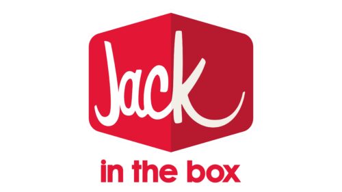
The redesign of 2022 has refined the tagline of the Jack in the Box badge, rewriting it in a more traditional sans-serif font with bolder lines of lowercase characters. With the new typeface, the badge started looking more balanced and stable, supporting the solidity of the main part of the logo and its intense colors.


