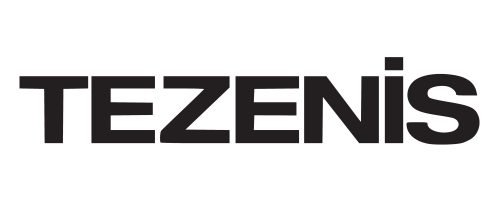
Tezenis is an Italian brand of underwear and sleepwear manufacturing company, which was founded in 2003. Today the brand is a part of The Calzedonia Group, which is one of the biggest players on the European market of the loungewear and lingerie.
Meaning and history
The Tezenis visual identity is minimalist yet bold and saucy. Its text-based logo is instantly recognizable all over the globe.
The Tezenis wordmark is executed in all capital letters except for the “I”, which is written in the lowercase but is the same size as all the other letter of the nameplate, and its solid big dot, replaced by the square, is placed above the upper line of the inscription.
The typeface of the Tezenis wordmark is a geometric sans-serif, which has straight strong lines and cuts of the letters and its’ edges.
The monochrome color palette of the Tezenis logo is a traditional option for the fashion brand, but the company prefers to use white lettering on a black background, which shows its confidence and a young and rebellious spirit.
The Tezenis logo is contemporary and minimalist, it looks great on all kinds of placement and bright and recognizable in the signboards, where the three-dimensional white letters of the nameplate catch everyone’s attention.


