Technicolor is the name of one of the oldest French communications companies, which was established in 1893 as Thomson SARL. Today the company operates globally, having its subsidiary in the United States, and specializing in animation, filming, and entertainment industries.
Meaning and history
Technicolor is a world leader in media and entertainment technology.Their world-class research and innovation labs enable them to be at the forefront of the market in providing video services for content creators and distributors.The company also owns a broad portfolio of intellectual property related primarily to visual and audio technologies.
The name of the company comes from the concept of the “Technical color”, and was adopted in 1916. Already in 1917, The Technicolor Motion Picture Corporation of America released the first Technicolor film in a two-color additive system, called The Gulf Between. Walt Disney’s three-color short animated cartoon was released in 1932, and three years later the film Becky Sharp appeared.
What is Technicolor?
Technicolor is the brand name for the processing of motion pictures, which was first introduced in the 1910s and today is used by all major film studios all over the globe. The French brand is being constantly updated and is always one step ahead of all its competitors.
1914 – 1936

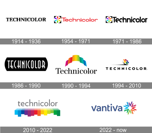
The Technicolor logo from 1914 featured a simple yet bold and solid black logotype in the uppercase, executed in a confident serif font and placed on a white background. The letters were slightly extended and placed with some space from each other, looking balanced and professional.
1954 – 1971
In 1954 the logo of the company got a graphical part added to the lettering. It was a solid black square with a large white circle on it. Inside the circle, there was a red stylized flower composed of six petals placed around a tiny red dot. The logotype of the brand was written in a black title case and executed in a custom extended typeface with barely visible serifs at the ends of the letter lines.
1971 – 1986
The redesign of 1971 redrawn the Technicolor logotype in a monochrome color palette, enlarging all of the elements and emboldening the lines. The typeface of the inscription was switched to a modern sans-serif with shortened lines of the letters “E” and “C”.
1986 – 1990

In 1986 the Technicolor logo was changed again. This time it was a completely different style. The thin modern inscription in white sans-serif was placed on a plain black badge which was horizontally oriented and its sides arched from the center. The badge looked strong and modern, yet at the same time evoking a sense of timeless elegance.
1990 – 1994
 Until the 1990s, the visual identity of a French company has always n executed in a monochrome color palette and had a bright red accent in it only once. But starting from 1990, the Technicolor logo has become colorful and dynamic, evoking a smile and sense of friendliness.
1994 – 2010
The redesign of 1994 introduced a new logo for the brand. It was a colorful Film image placed above the massive and extended black wordmark executed in a bold geometric sans-serif typeface. The stable inscription was balanced by the lightness and freshness of the graphical part and its smooth rounded lines.
2010 – 2022
The Technicolor logo we all can see today was designed in 2010. It is composed of a light gray wordmark in the lowercase, executed in a simple and clean sans-serif typeface with smooth contours and classic cuts of the letters.
Under the wordmark, there is an emblem, which also plays an underline part for the lettering. The geometric emblem is composed of several colorful rectangles of different heights, which show all the rainbow color palette, reflecting the industry of the company and its specialization.
The emblem also reminds of a sound equalizer, pointing on the creative and progressive approach of the company with a very rich history and intense legacy.
The Technicolor logo is a mix of simplicity and brightness, seriousness and playfulness, confidence, and future-thinking.
It is a brilliant example of a contemporary visual identity design, which uses many colors but doesn’t look overloaded or tasteless.
2022 – Today
The brand changed its name to Vantiva in 2022, which also called for a logo redesign. The new logotype uses the company’s new name with a new emblem on its immediate right. The name bit uses lowercase letters in a mostly ordinary sans-serif style, besides the ‘v’ letters, which have an unusually longer right bar. The letters are colored a dark blue similar to Facebook’s.
The emblem alludes to the company’s newfound focus on solar aesthetic, and it similarly resembles a sun. It’s made of several letters ‘v’ in the same exact style as they appear in the name bit. They are, however, painted in different bright colors and radiate from the center like rays.
Font and Color
The modern lowercase lettering from the official Technicolor logo is set in a clean geometric sans-serif font with distinctive contours of the full-shapes characters. The closest fonts to the one, used in this insignia, are, probably, Quire Sans Pro Regular, or Joanna Sans Nova Regular.
As for the color palette of the Technicolor visual identity, the logo of the company has it all: three shades of blue, three shades of purple, red, orange, yellow, and green tones. This scheme represents the original specialization of the company and brilliantly supports its name.


