

![]() Team Fortress 2 PNG
Team Fortress 2 PNG
Team Fortress 2 is a Quake sequel. The first shooter game was released in 2097 and has its version for both PlayStation and Xbox consoles as well as Windows, macOS, and Linux operating systems. The team game was first announced in 1998 but the developers decided to change it so the release was made only nine years after.
Meaning and history
![]()
Team Fortress 2 is the video game, which was first introduced in 1998when the authors of Team Fortress for Quake were going to release its paid version for Quake 2. A year later the team joined Valve and transferred their findings to Half-Life, creating Team Fortress Classic.
Team Fortress 2 is a grotesque spyaction game set in the style of the 1950s. Players divided into two teams, Red and Blue, fight against each other, playing for several different fighting classes, each armed with unique weapons. Battles take place in multiple modes and on multiple maps, allowing forgood replayability.
Old
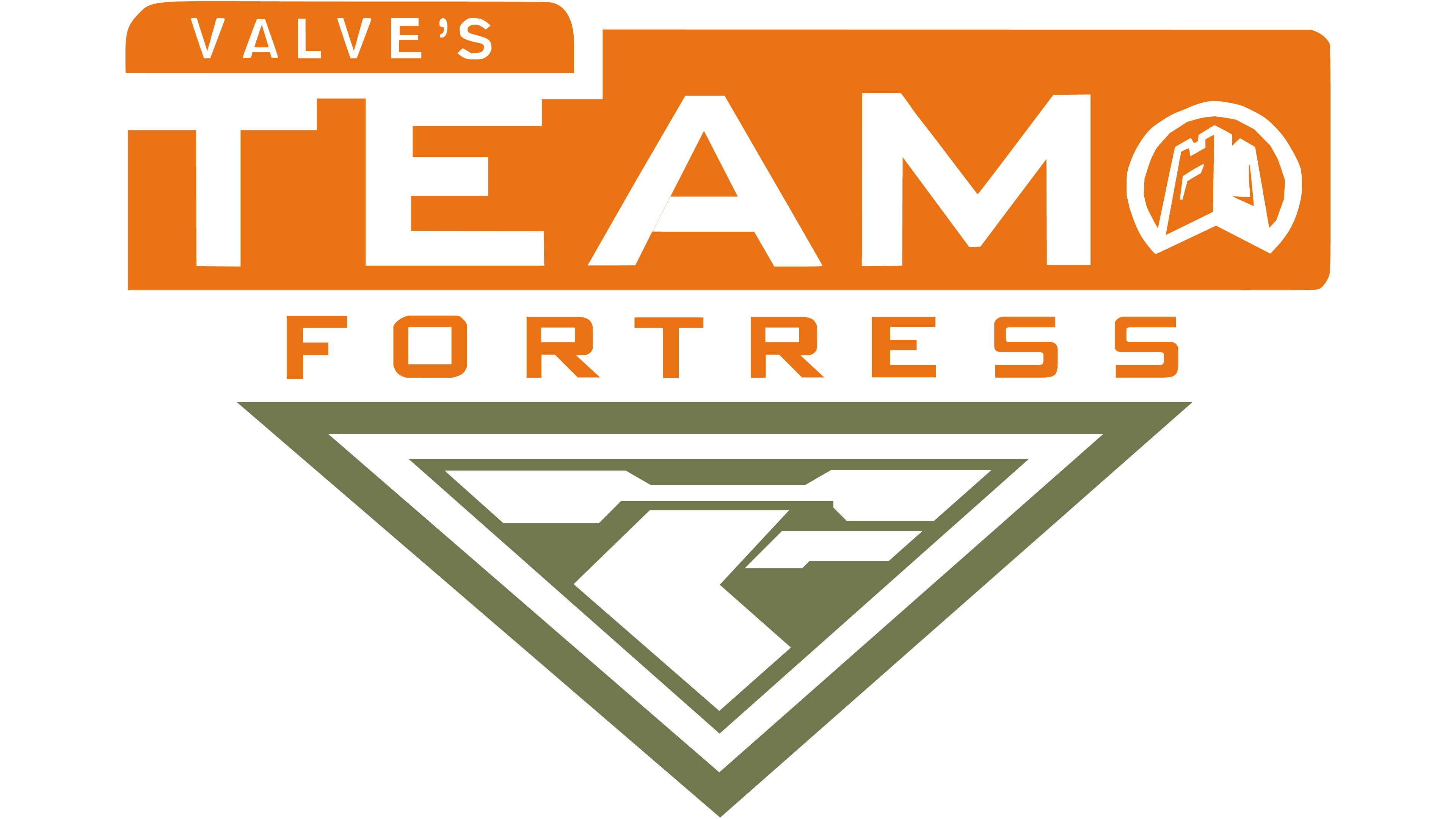
The first Team Fortress 2 logo featured a bold and bright composition, executed in an orange, khaki, and white color palette, with the triangular crest underliningheavily stylized lettering. The white uppercase inscription on the orange horizontal banner was accompanied by a white roundel with a fortress image in it. As for the triangle, it was executed in a khaki and white color palette with an ornament, formed by geometric elements.
Old
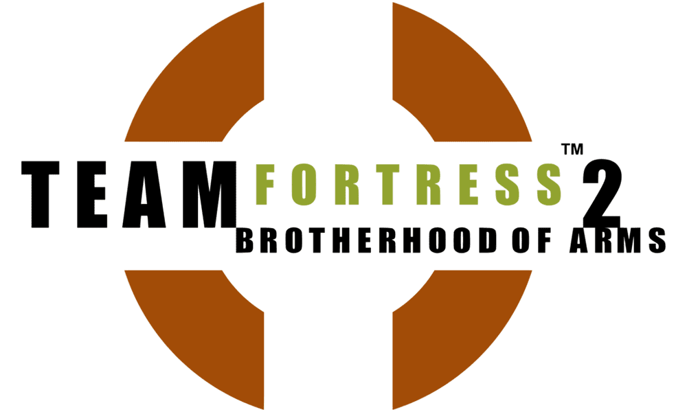
Another logo, used by the franchise, featured a completely different style and color palette. This version boasted a black and green lettering executed in an extra-bold geometric sans-serif font, placed against a plain white background and enclosed into two brown rounded brackets, horizontally cut in halves, making up a target symbol.
2007 – Today
![]()
The Team Fortress 2 logo is text-based. Composed of a wordmark with a delicate graphical symbol, it looks bright and confident.
The Team Fortress 2 nameplate is executed in a bold sans-serif typeface, which is very similar to Compacta Bold, created by Fred Lambert. All the capital letters of the inscription are drawn in gradient white and have thick orange outline and shadow.
The letters “T” and “F”, as well as “2”, are enlarged and look powerful in the con-densed square wordmark.

The rounded aim symbol in black is placed over the inscription, between the two words. When used on its own, the emblem is usually colored orange and has a black outline.
The white, orange and black color palette of the Team Fortress 2 logo is a repre-sentation of passion, power, and creativity. It looks friendly and welcoming, yet the shapes and boldness of the letter lines evoke a sense of masculinity and strength.
Font and color
The stylized uppercase lettering from the primary Team Fortress 2 logo is set in a heavy narrowed and-serif font with some of the contours slightly torn, and the characters accompanied by an extra-thick orange shadow. The closest fonts to the one, used in this insignia, are, probably, Robson Bold, or Kuunari Rounded Black Compressed, with some designer additions to the contours.
As for the color palette of the Team Fortress 2 visual identity, it is based on a combination of white and gradient brown with an addition of a black element. The scheme looks very brutal and strict, reflecting the plot and essence of the game, and making the logo stand out in the list of its competitors.


