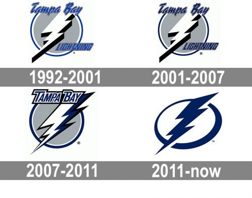
While the logo of the ice hockey team Tampa Bay has changed its overall look not less than four times, its main symbol – a lightning bolt inside a circle frame – has been the same ever since it was introduced more than 25 years ago.
Meaning and history
The recognizable unique symbol of Tampa Bay Lightning was created in like 5 seconds, drawn on a napkin by one of the club’s founders. The official logo version was introduced in 1992 and since then has never been changed, just slightly modernized and refined, keeping the original cold, freshness, and sharpness.
What is Tampa Bay Lightning?
Tampa Bay Lightning is the name of a professional hockey club in the United States, which was established in 1992. Today the club competes in the National hockey league as a member of the Eastern Conference. Tampa Bay Lightning has Amalie Arena in Florida as its home stadium and Jon Cooper as the head coach.
1992 — 2001
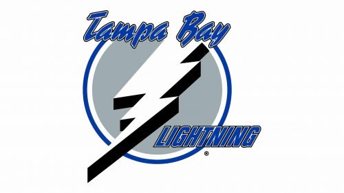
The initial logo was designed for Tampa Bay Lightning by Phil Esposito and boasted a monochrome and blue composition, consisting of a circular badge with an enlarged white and black lightning bolt on it and blue lettering on top and bottom lines. The upper part of the inscription, “Tampa Bay”, was written in a bold outlines cursive, while the “Lightning” on the bottom was executed in a narrowed and italicized sans-serif font.
2001 — 2007
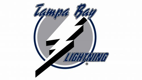
The redesign of 2001 only refined the inner, blue, lines of the wordmark by making them thinner and the white part of the outline a bit wider, which made the whole inscription brighter and more readable. The blue color of the team’s visual identity palette was a bit muted and became more confident and professional.
2007 — 2011
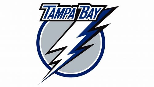
The first serious redesign of the Tampa Bay Lightning logo was held in 2007, bringing sharper lines and a modern inscription, which was now composed of only the “Tampa Bay” line, placed on the upper part of the circle with a flash of lightning, executed in blue. The new style of the wordmark featured a straight and bold sans-serif typeface with clean distinct lines and confident character. The blue color was added to the lightning bolt itself, replacing the thick black shadow from the previous versions.
2011 — Today
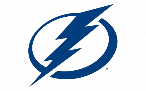
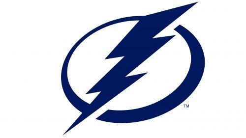
In 2011 the iconic logo was modernized and minimized. The lettering was completely removed from the official variant of the emblem, which now featured a blue and white composition, consisting of an outlined circle with an oversized blue lighting bolt on it. The clean lines and sharp angles of the image, balanced by a smooth framing, evoke a sense of progressiveness and energy, along with the professionalism and reliability of the hockey team.
Symbol
The design introduced in advance of the 2007/08 playing season had a more refined and professional look. The text became more legible as the script font was replaced by a traditional typeface. The word “Lightning” disappeared, due to which the image became cleaner. The lightning and its shadow were modified in a way that made it look as if it was slightly turned. The outline grew bolder, while the shadow of the lightning became dark blue.
In fact, this logo was a result of a long search for a new brand identity. According to Ron Campbell, who used to be team President at the time, they were looking for “something that people will gravitate to, something they will have pride in,” but they also didn’t expect a drastic change.
Interestingly enough, the introduction of the new identity coincided with the beginning of a highly unsuccessful period for the team.
Font
The primary Tampa Bay Lightning logo doesn’t contain any letters, but the team has an extended version of the logo with the words “Tampa Bay” in white capitals. While the lettering is rather a custom work than a retail font, several typefaces look somewhat similar: Industry Black Italic, Komu A, Nomad, and Duke, to name just a few.
Colors
The team calls the shade of blue used on its logo Tampa Bay Blue. This is a rather dark and saturated shade, which creates a good contrast when used on the white background.
BLUE
PANTONE: PMS 281 C
HEX COLOR: #002868;
RGB: (0, 40, 104)
CMYK: (100, 85, 5, 36)
WHITE
HEX COLOR: #FFFFFF;
RGB: (255, 255, 255)
CMYK: (0, 0, 0, 0)


