The colorful palette and bold shapes make the logo of the TAG Heuer watch brand stand out among its competitors.
Meaning and history
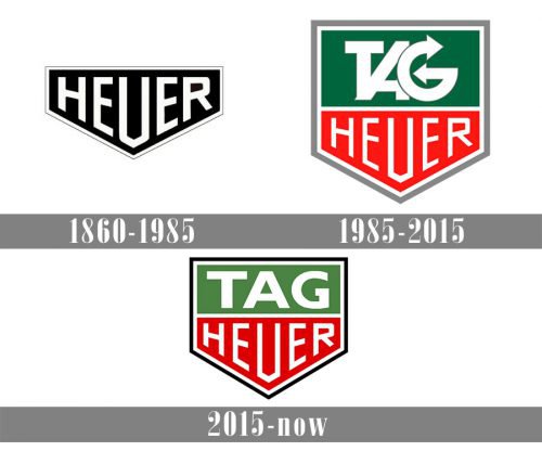
Tag Heuer is the brand with a long history, though its visual identity has been pretty constant, having only two major redesigns, but keeping the geometry and strength of the original badge until now. The iconic emblem of the brand is based on masculinity and confidence, and this is what makes it remarkable and outstanding.
What is TAG Heuer?
TAG Heuer is a Swiss luxury watchmaker known for its sports watches and chronographs. Founded in 1860, the company has a rich heritage in watchmaking and is celebrated for its precision, innovative technology, and connection with the sports world.
1860 – 1985
The original Tag Heuer badge was introduced in 1860 and boasted a super modern and powerful monochrome crest, horizontally stretched and having its triangular peak pointing down. The black background of the emblem was balanced by a thick white frame and the white “Heuer” inscription in all capitals, which was placed inside the crest, repeating its contours.
1985 – 2015
After the Heuer brand was renamed to Tag Heuer in 1985, the new logo was created. The original geometric crest was kept by the designers, though now it was stretched vertically, giving a place for a new part of the company’s name. The emblem now was horizontally divided into green part (on top), and red (on the bottom), with the stylized extra-bold “Tag” in white placed in green, and “Heuer” in its iconic typeface — on red. The upper part of the inscription has its letters overlapping each other and both ends of the “G” drawn as the arrows. The badge was outlined in white and gray and looked bright yet classy and chic.
2015 – Today
The redesign of 2015 only slightly modernized the shape of the crest, stretching it to the sides, and changed the style of the “Tag” lettering, writing it in an extended bold Sans-serif typeface, with all lines thick and stable. The color of the outline was switched to white and black, which added strictness and timelessness to the badge.
Font
The TAG Heuer watch logo combines two versions of presumably one and the same typeface called Gill Sans, which was developed by Eric Gill. While the lettering “TAG” appears to feature Gill Sans Bold, the word “Heuer” is given in Gill Sans Light.
Colors
The color scheme of the current TAG Heuer logo includes green, red orange, white, and black – quite a diverse palette for a watch brand.


