TACA is a prominent airline today, providing reliable air transportation services. It is owned by Avianca Holdings, a leading Latin American airline conglomerate. TACA operates across various destinations, including North, Central, and South America, as well as the Caribbean. With its extensive route network and high-quality services, TACA has established itself as a key player in the aviation industry.
Meaning and history
TACA Airlines, founded in 1931 by Lowell Yerex, is a prominent airline based in El Salvador. Throughout its history, TACA has achieved several significant milestones. In 1951, it became the first airline in Latin America to operate a passenger jet, introducing the French-built Sud Aviation Caravelle. TACA expanded its route network and modernized its fleet over the years, introducing Boeing 737s and Airbus A320s.
In 2009, TACA became a founding member of the airline alliance called AviancaTACA, which later rebranded as Avianca in 2013. This merger strengthened the airline’s presence in the region and provided improved connectivity to destinations worldwide.
Today, TACA operates as part of Avianca, a major airline serving both domestic and international routes. With a modern fleet and a strong network, TACA continues to provide reliable air travel services, contributing to the growth of the aviation industry in Central America and beyond.
What is TACA?
TACA, also known as Transportes Aéreos del Continente Americano, was a former airline based in Central America. It was one of the leading airlines in the region, offering domestic and international flights to destinations in North, Central, and South America. However, TACA has undergone a series of mergers and acquisitions and is now part of Avianca, a major airline in Latin America.
1931 – 1936
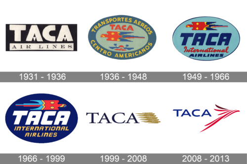
The first TACA logo, designed at the beginning of the 1930s, stayed with the company for just five years. It was a black and white banner with stylized white lettering in an extra-bold sans-serif typeface set against a solid black background and underlined by a narrow rectangular banner in white with an elegant serif inscription on it.
1936 – 1948
The redesign of 1936 introduced a colorful oval badge, set in a blue, red, and yellow palette. The central part of the medallion had an image of a stylized bird and bold red lettering above it, while the long inscription was set in yellow sans-serif capitals around a dark blue framing.
1949 – 1966
The TACA logo from the end of the 1940s was based on the previous version, with the colors intensified and the elements refined and cleaned up. The framing with the yellow lettering was removed from the composition, and now the bird was set above a three-leveled inscription.
1966 – 1999
The redesign of 1966 changed the color palette of the TACA logo and the orientation of the bird, which was now facing to the right. The new badge was set in dark blue, with the lettering turning white and yellow. The font of the inscription was changed to a modern one.
1999 – 2008
In 1999 the composition of the TACA logo was completely changed. The new image was composed of elegant serif lettering in dark blue, set on a plain transparent background and followed by a golden emblem, formed by five birds, resembling the one from the previous version.
2008 – 2013
The redesign of 2008 introduced the final version of the TACA logo. The lettering switched its font to a modern and smooth sans-serif, and the shade of blue was brightened up. As for the graphical part, it was redrawn and now featured a red and burgundy image resembling a bird with long feathers.


