

![]() Swiss International Air Lines Logo PNG
Swiss International Air Lines Logo PNG
Both the old and the current versions of the Swiss International Air Lines logo are heavily inspired by the national flag of Switzerland, which is a white cross inside a red cross. While the logo of the company’s predecessor, Swissair, looked different, the source of inspiration behind it was the same.
Brand Overview
Swiss International Air Lines AG, more known as Swiss or Swiss Air Lines, is the flag carrier of Switzerland. The company appeared after Swissair, Switzerland’s then flag carrier, went bankrupt in 2002. It used many assets of its predecessor.
Today, the airline has over 90 airplanes and flies to over 100 destinations.
Meaning and history
![]()
The birth date of the airline is 2002. In the same year the first flights began and the Swiss WorldCargo division was established.
From its founding until 2005, the airline suffered heavy losses, amounting to more than 1.5 billion U.S. dollars. After long negotiations with various major airlines, the decision was made to merge with Luthansa to avoid bankruptcy.
In March 2006 Swiss WorldCargo and Lufthansa Cargo entered into a marketing and sales cooperation agreement.
Swiss WorldCargo together with Swiss Worx introduced in 2009 the dedicated SkyChain system, a comprehensive cargo management system from loading to unloading, developed in Dubai by the provider Mercator.
In July 2011, Swiss becomes a founding member of IG (Interest Group) Air Cargo Switzerland.
What is Swiss International Air Lines?
Swiss International Air Lines is the largest air carrier in Switzerland. The main activity is the implementation of international scheduled flights to Europe, Asia, Africa, as well as North and South America. Founded in 2002, Swiss Airlines is a subsidiary of the major German carrier Lufthansa. Moreover, the carrier is a member of the aviation alliance Star Alliance.
2002
![]()
The original logo existed in two versions. Both of them featured a red square housing various design elements in white. The red square on one of the logos housed the word “Swiss” and a cross in the bottom right corner. Here, the glyphs were rather large. All the letters were lowercase.
The red square on the other logo housed the lettering “Swiss International Air Lines” in smaller letters. In this case, the initials were capitalized. In both the versions, a highly legible sans was used.
None of these logos seemed to make the most of the space they occupied. Also, there seemed to be no connection with the airline theme. The problems were resolved in the following version.
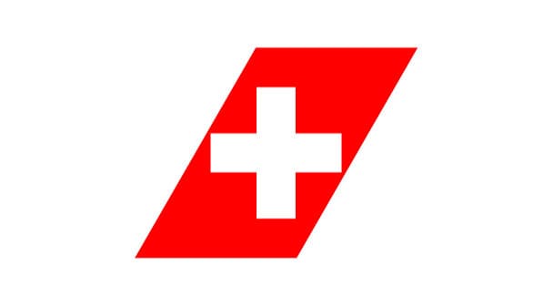
2011
![]()
Here, you can see a white cross placed inside a red shape. The shape symbolizes an element of the empennage of an aircraft thus creating a link with the airline industry.
The new Swiss International Air Lines logo can be paired with the tagline “Our sign is a promise.”
Font and Color
The bold uppercase red are lettering from the primary logo of Swiss International Air Lines is set in a modern geometric sans-serif typeface with stable characters, written in thick lines with distinctive contours and straight cuts of the ends. The closest fonts to the one, used in this insignia, are, probably, Zurich Std Black, or Neue Haas Unica Pro Heavy.
As for the color palette of the Swiss International Air Lines visual identity, it is based on red and white, the colors of the National flag of Switzerland, which look very powerful and elegant, and evoke a sense of reliability and confidence.


