The style of the McCafe logo does not create any link with the logo of the parent brand, McDonald’s. Instead, the design forces behind McCafe have created a completely independent, distinctive brand identity.
Meaning and history
McCafé is a coffee-house-style chain that belongs to McDonald’s. The first location opened as a Corporate store in 1993 in Melbourne, Victoria, Australia. It was only eight years later that the first location within the US started working in Chicago, Illinois. By 2003, McCafé was the largest coffee shop brand in Australia and New Zealand.
1993 – 2000
2000 – Today

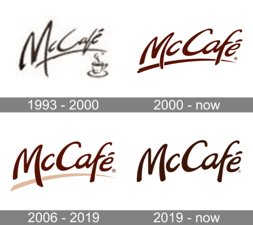
The earliest version of the logo featured the word “McCafé” in a custom type paired with a long stroke below, which looked as if it had been drawn by hand. The designers chose a cozy, comforting shade of brown inspired by the color of coffee.
This wordmark can be seen on coffee-related beverages that can be purchased at the McCafé side of the main ordering counter at most McDonald’s outlets. Also, it is used as signage over said portion of the counter.
2006 – 2019
The original McCafe logo looked pretty similar to the current primary logo. That is because both of them feature a casual style inspired by handwriting. And yet, you can notice several apparent differences.
The most obvious one is the way the long stroke below the wordmark looks like. In the original logo, the stroke is brown, like the lettering above. In the second logo it features a lighter shade of beige (like the coffee foam) and looks wider.
The shape of the glyphs is also slightly different, although it is hardly possible to notice the modifications unless you compare the two versions side by side.


