

![]() Vkusno – i Tochka Logo PNG
Vkusno – i Tochka Logo PNG
Vkusno — i Tochka is the name of a Russian chain of fast-food restaurants (Russian mcdonalds logo) , which was established in 2022, to replace the McDonald’s locations after the American giant has quit the Russian market.
Meaning and history
Vkusno — i Tochka (can be translated into English as “Tasty and That’s it”, as “Vkusno” is Russian for “Tasty”, and “Tochka” for “The Dot”) was opened just a few weeks after the official closure of McDonald’s operations on the territory of Russia.
It didn’t seem to be an easy task, considering McDonalds had over 850 locations across Russia, but the new company has managed to open the first 15 restaurants in one day, June 12, and plans to not only fill all of the free 850 spots but to make it to a thousand, opening from 50 to 100 stores a week.
The chain sold its business to a Russian businessman from Novokuznetsk, Kuzbass region, Alexander Govor. He already owned a McDonald’s franchise in that area, while the company was operating in Russia.
The new chain easily integrates into existing service concepts, plus the company has maintained a system of relationships with suppliers, so according to the management of Vkusno — i Tochka, the consumers of the new chain will not notice a difference in menu and flavors.
Although, at the first stage of opening the familiar menu will not be fully available due to logistics problems and difficulties with the packaging. The menu will not include Big Mac burgers and McFlurry ice cream because of the strong association with the McDonald’s brand.
What is Vkusno — i Tochka?
Vkusno — i Tochka is a chain of Russian fast-food restaurants, which was opened on the former McDonald’s premises after the American company left the Russian market in 2022. The new brand has the same idea, as McDonald’s, with some modifications to the menu and visual identity.
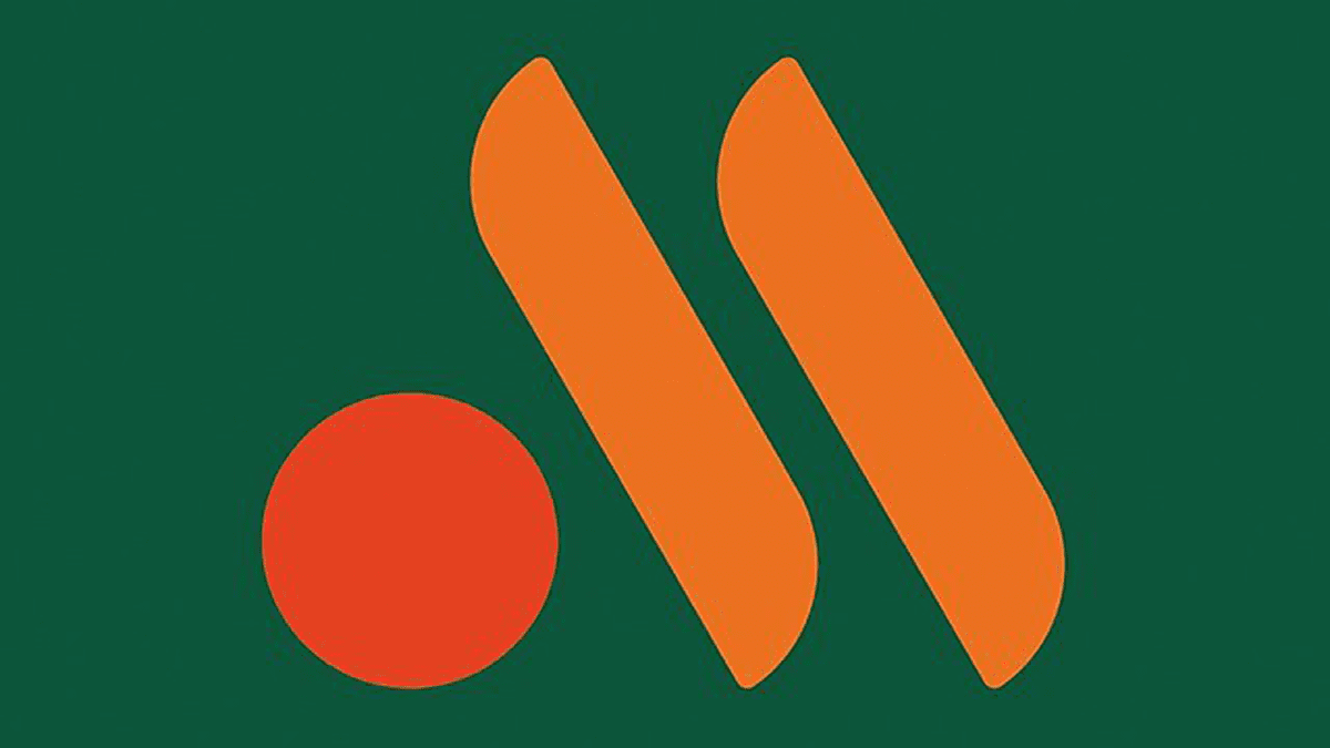
As for the visual identity, the fast-food company, that replaced McDonald’s in Russia has chosen an abstract and minimalistic design with a bright color palette. The badge is composed of three elements in different shades of orange, set on a solid background, executed in dark green, with no additional lettering.
2022 – Today
![]()
The new logo for Vkusno — i Tochka, the Russian fast-food restaurant chain, is composed of yellow sticks, placed diagonally and symbolizing French fries, and an intense orange circle, placed in the bottom left corner of the composition and representing a burger. The elements are placed against a dark green background, which alludes to the quality of product and service that customers are used to.
Font and color
As already mentioned above, the primary logo of the Russian fast-food chain has no lettering on it, so we can not discuss the typeface, although, the color palette of the Vkusno — i Tochka badge is pretty interesting. The logo is executed in gradient orange and dark green, with all three elements set in two shades of orange, representing fries and burgers, and the background is solid. The dark shade of green stands for excellence and growth, and since the company is in its beginning stage, it makes sense.


