

![]() Strawberry Shortcake Logo PNG
Strawberry Shortcake Logo PNG
Strawberry Shortcake, primarily recognized for its roots in greeting cards, is now a well-known franchise owned by Iconix Brand Group. It operates predominantly in the United States, where it has evolved from simple greeting cards into a comprehensive range of merchandise, animated television series, and films targeted primarily at young girls.
Meaning and History
![]()
Strawberry Shortcake was originally created by Muriel Fahrion, a greeting card illustrator for American Greetings, in 1973. The character was designed to be used on greeting cards, but the concept quickly expanded. Throughout the 1980s, Strawberry Shortcake grew into a substantial franchise, including toys, dolls, and other merchandise. Over the decades, Strawberry Shortcake has achieved significant milestones, such as the launch of numerous animated series and a vast array of products that extend beyond the initial scope of greeting cards. As of today, the franchise continues to hold a beloved place in the cultural landscape, appealing to new generations of children and nostalgic adults alike, which underscores its enduring legacy and current market relevance.
What is Strawberry Shortcake?
Strawberry Shortcake is a multi-faceted franchise that encompasses a range of children’s entertainment and products, including television programs in the United States. It is particularly noted for its animated series that feature the adventures of the titular character and her friends.
1980 – 2003
![]()
The 1980 Strawberry Shortcake logo is a nostalgic representation of the brand’s early days. This logo features a simple yet elegant design, primarily using a deep red color for the text. The font is classic and slightly whimsical, with delicate curves and swirls that give it a vintage feel. The words “Strawberry Shortcake” are stacked, with “Strawberry” on top and “Shortcake” below, both centered. Each letter is evenly spaced, providing a balanced and cohesive look. There are no additional graphics or embellishments, allowing the text to take center stage. The simplicity of this logo reflects the straightforward and charming nature of the original Strawberry Shortcake character and brand. It evokes a sense of nostalgia and timeless appeal, reminding fans of the brand’s origins and the beloved character that has been cherished for decades.
1991 – 2003
![]()
The 1991 Strawberry Shortcake logo introduces a fresh and modern twist to the classic design. The logo features the brand name in a bubbly and rounded font, exuding a sense of fun and playfulness. The letters are a bright pink color with a white outline, making them pop against the background. The text is arranged in a slightly curved manner, giving the logo a dynamic and energetic feel. Surrounding the text is a pink outline that mirrors the shape of the letters, adding depth and dimension to the design. This version of the logo maintains the charm and sweetness of the brand while updating it with a more contemporary and youthful look. The playful typography and vibrant colors reflect the brand’s evolution and its appeal to a new generation of fans.
2003 – 2009
![]()
The 2003 Strawberry Shortcake logo represents a significant evolution in the brand’s visual identity. This logo features a more elaborate and detailed design, with the brand name enclosed in an oval shape. The text is written in a lively and curvaceous font, with each letter meticulously crafted to convey a sense of whimsy and joy. The letters are colored in a cheerful pink, with green accents that add a touch of freshness and natural appeal. At the top of the oval, a small, stylized strawberry graphic is prominently displayed, reinforcing the brand’s identity. The oval itself is outlined in green, creating a cohesive and harmonious look. This logo exudes a sense of sophistication and creativity, while still maintaining the playful and endearing qualities that fans love about Strawberry Shortcake. It marks a period of reinvention for the brand, appealing to both nostalgic fans and new audiences.
2009 – 2021
![]()
The 2009 Strawberry Shortcake logo is a vibrant and intricate design that captures the essence of the brand’s playful and sweet nature. This logo features the brand name in a bold and curvaceous font, colored in a bright pink hue that exudes energy and happiness. The text is surrounded by a decorative frame of green vines and leaves, interspersed with small strawberries and flowers. This botanical motif adds a touch of whimsy and natural beauty, emphasizing the strawberry theme. The letters are adorned with white accents, creating a sense of depth and dimension. This logo is both elaborate and cohesive, effectively blending text and imagery to create a visually appealing and memorable design. It reflects the brand’s ongoing commitment to delighting its audience with charming and imaginative visuals.
2021 – Today
![]()
The latest Strawberry Shortcake logo is a modern and dynamic design that incorporates both text and character elements. The logo features the brand name in a bold, white font with a pink outline, making it stand out prominently. The text is placed within a large, red strawberry shape, complete with green leaves at the top, which anchors the design and ties it directly to the brand’s theme. Above the text, a depiction of the Strawberry Shortcake character is prominently featured, adding a personal and playful touch. The character is illustrated in a modern, cartoonish style, with vibrant colors and expressive features. This combination of text and character elements creates a lively and engaging logo that appeals to both children and adults. It effectively communicates the brand’s fun, friendly, and sweet nature, making it instantly recognizable and beloved by fans around the world.
Emblem
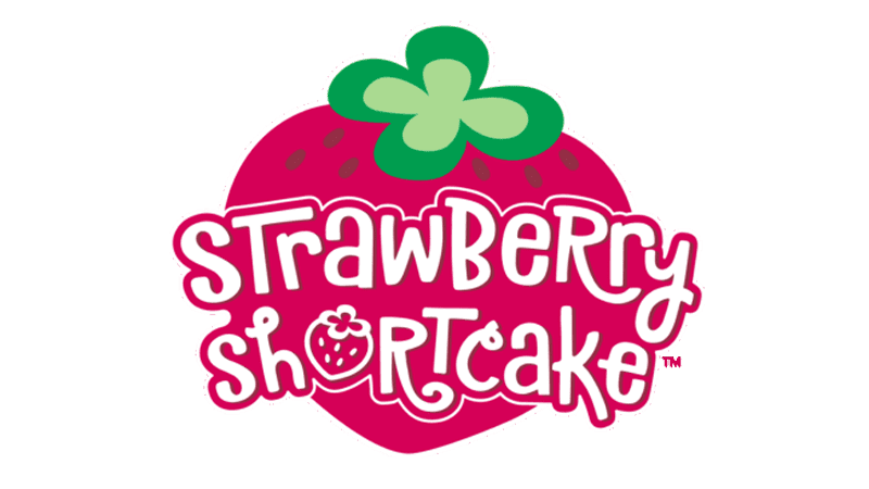
The Strawberry Shortcake emblem is characterized by its playful and vibrant design. Dominated by a large, red strawberry shape, the emblem captures the essence of the brand’s name and character. The strawberry is adorned with a green leaf at the top, adding a touch of natural authenticity. The brand name “Strawberry Shortcake” is creatively integrated within the strawberry, using a whimsical and bold font. The letters are white with a pink outline, making them stand out against the red background. The text is slightly tilted and features a mix of upper and lower case letters, contributing to the playful and informal feel of the logo. The inclusion of a small strawberry illustration within the letter “O” in “Shortcake” adds an extra layer of charm and detail. This emblem effectively communicates the fun, friendly, and sweet nature of the Strawberry Shortcake brand, making it instantly recognizable and appealing to children and adults alike.


